Bupa optical
Responsive Design
UX/UI Designer
Research
Product thinking
Сustomer experience
Interactions design
Ecommerce
Mobile Responsive
Problem Statement
Lack of Awareness
Bupa members were unaware of Bupa Optical services.
Low Switching Motivation
The current value proposition failed to entice customers to switch from competitors.
Positioning
Customers were unclear if Bupa Optical services matched or exceeded competitor standards.
A seamless optical purchasing experience for Bupa HI members
Address key customer pain points with prioritised features:
Personalised pricing and automated claiming for frictionless transactions.
Phases of Implementation
The project was executed in 3 distinct phases, each addressing a core customer need:
1
Authentication & Remaining Limits
Enable customers to log in via MyBupa to view remaining benefits directly on the optical site, ensuring a personalised shopping experience.
2
Personalised Pricing & Claiming at Checkout
Provide transparency on out-of-pocket costs and streamline claiming during checkout.
3
Pre-Filled Prescriptions
Simplify the prescription entry process for frames and contact lenses to reduce drop-offs and improve conversion rates.
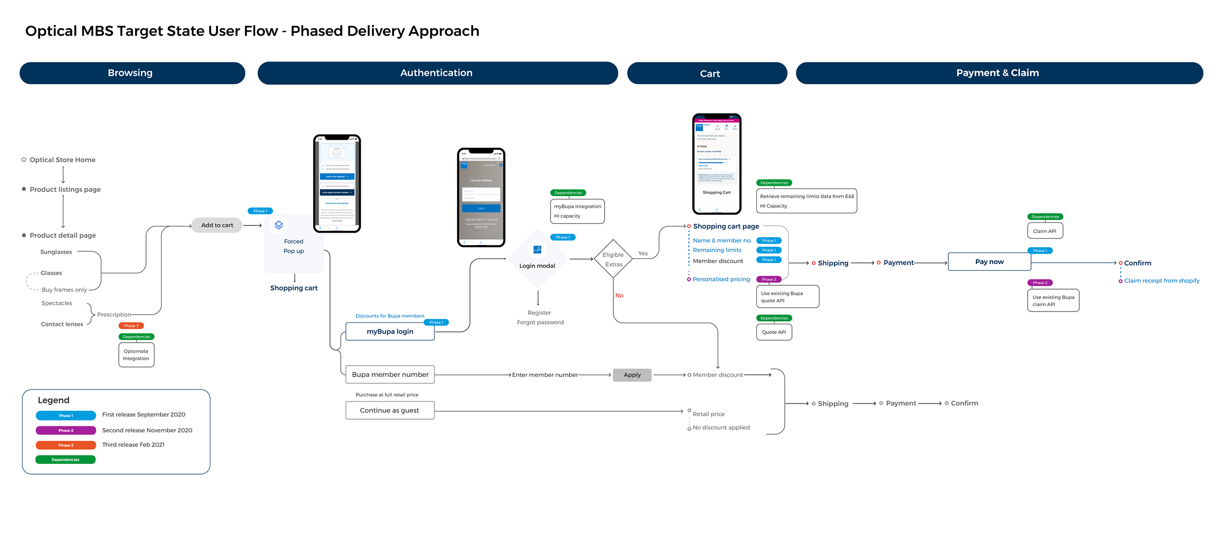
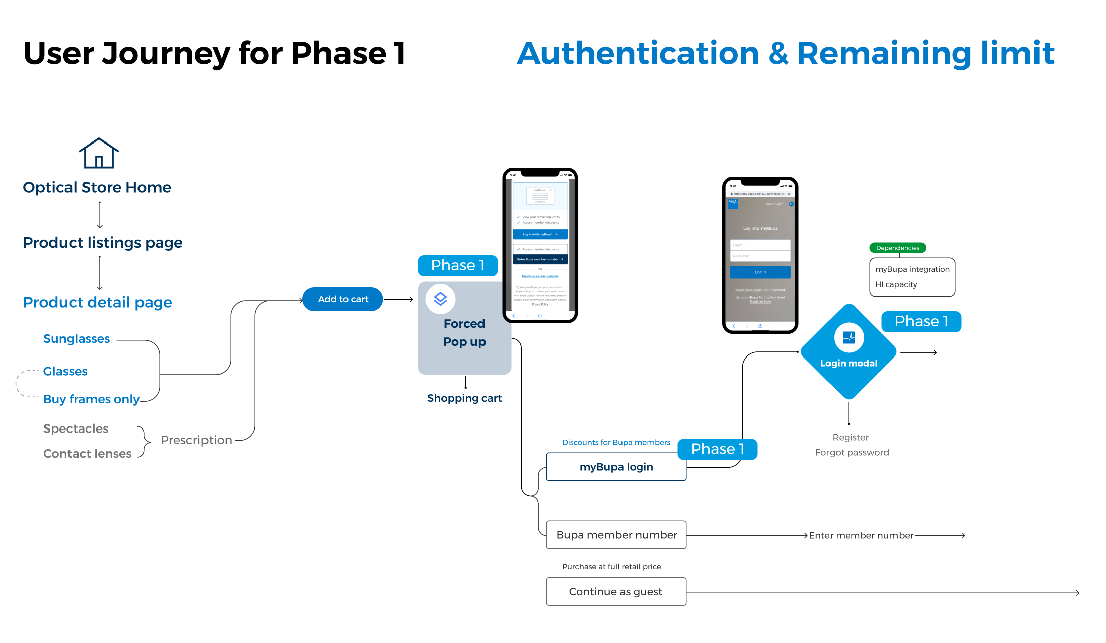
Userflow
Phase 1
Authentication & Remaining Limit
Challenges
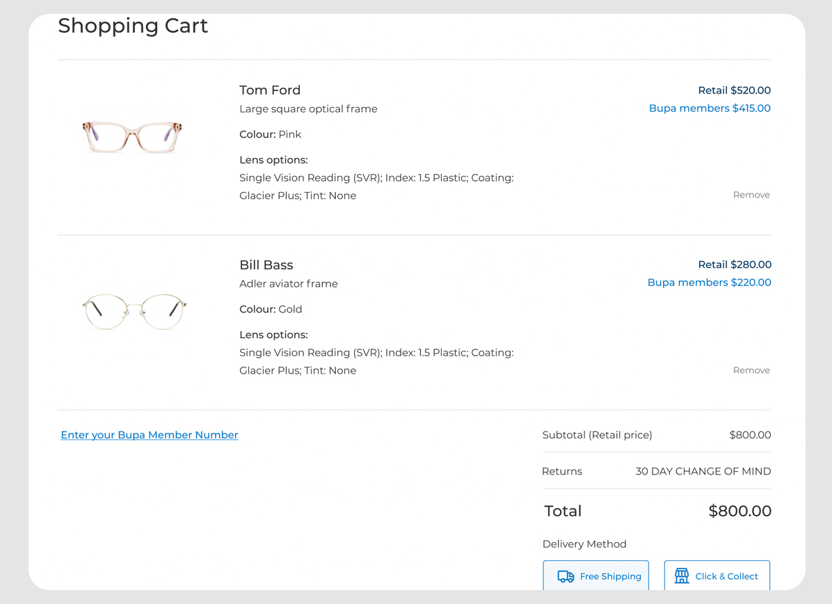
User research
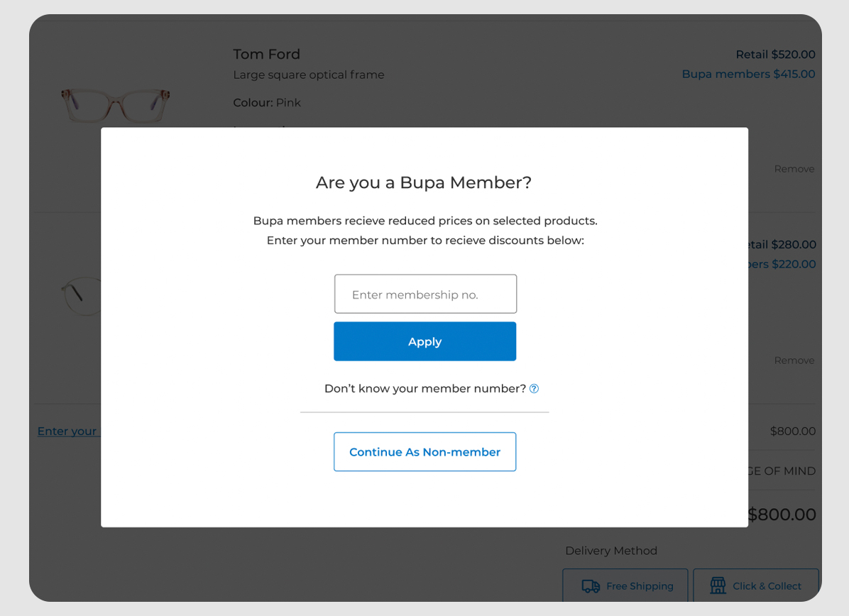
To address the challenges, I redesigned two styles of pop-up modals to improve functionality. I aim to gather feedback on the designs to refine them and support the initial release. The research will focus on:
- Evaluating whether users see value in the functionality.
- Assessing if they understand the remaining limit and auto-claim functionality.
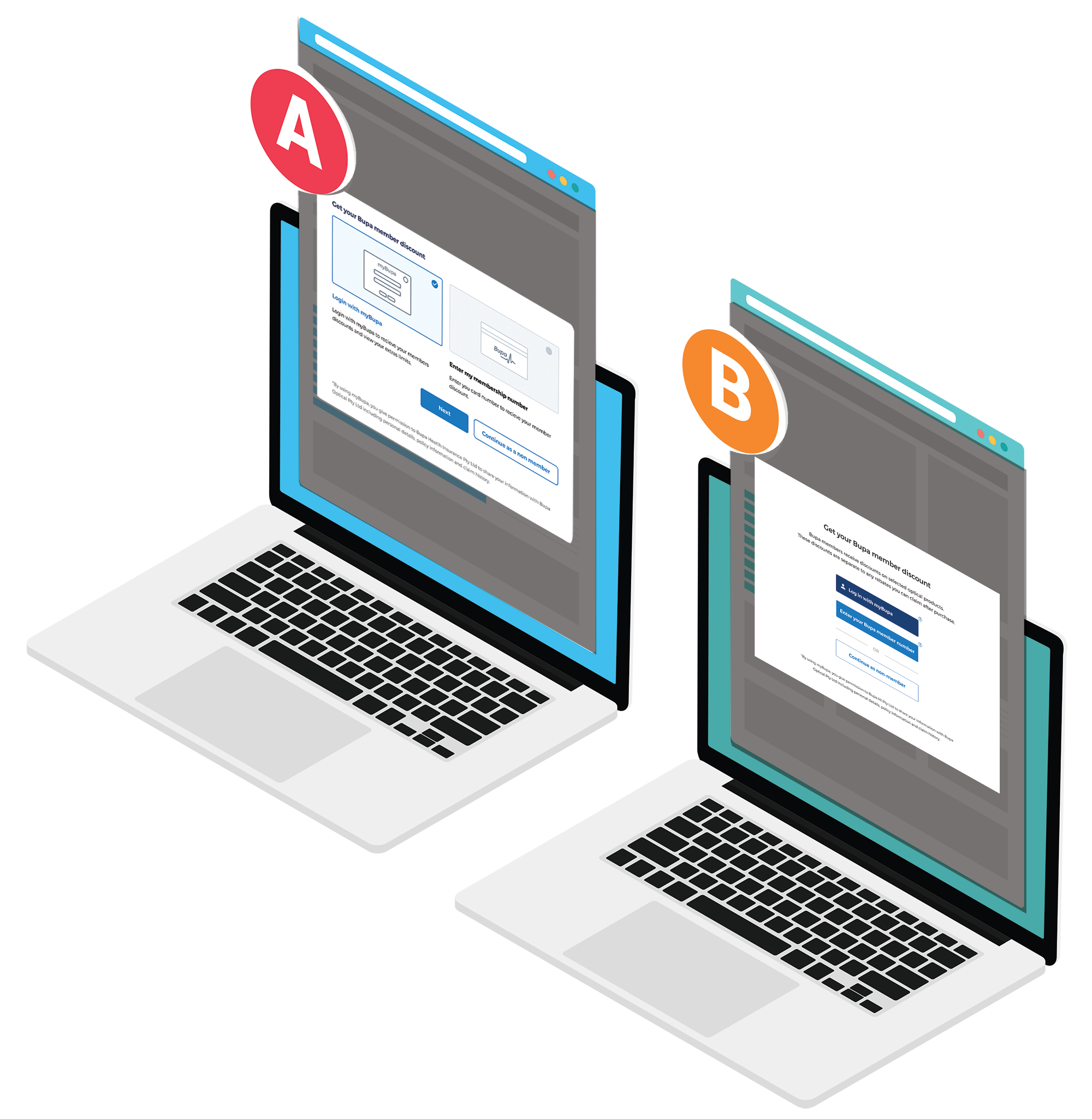
Type A
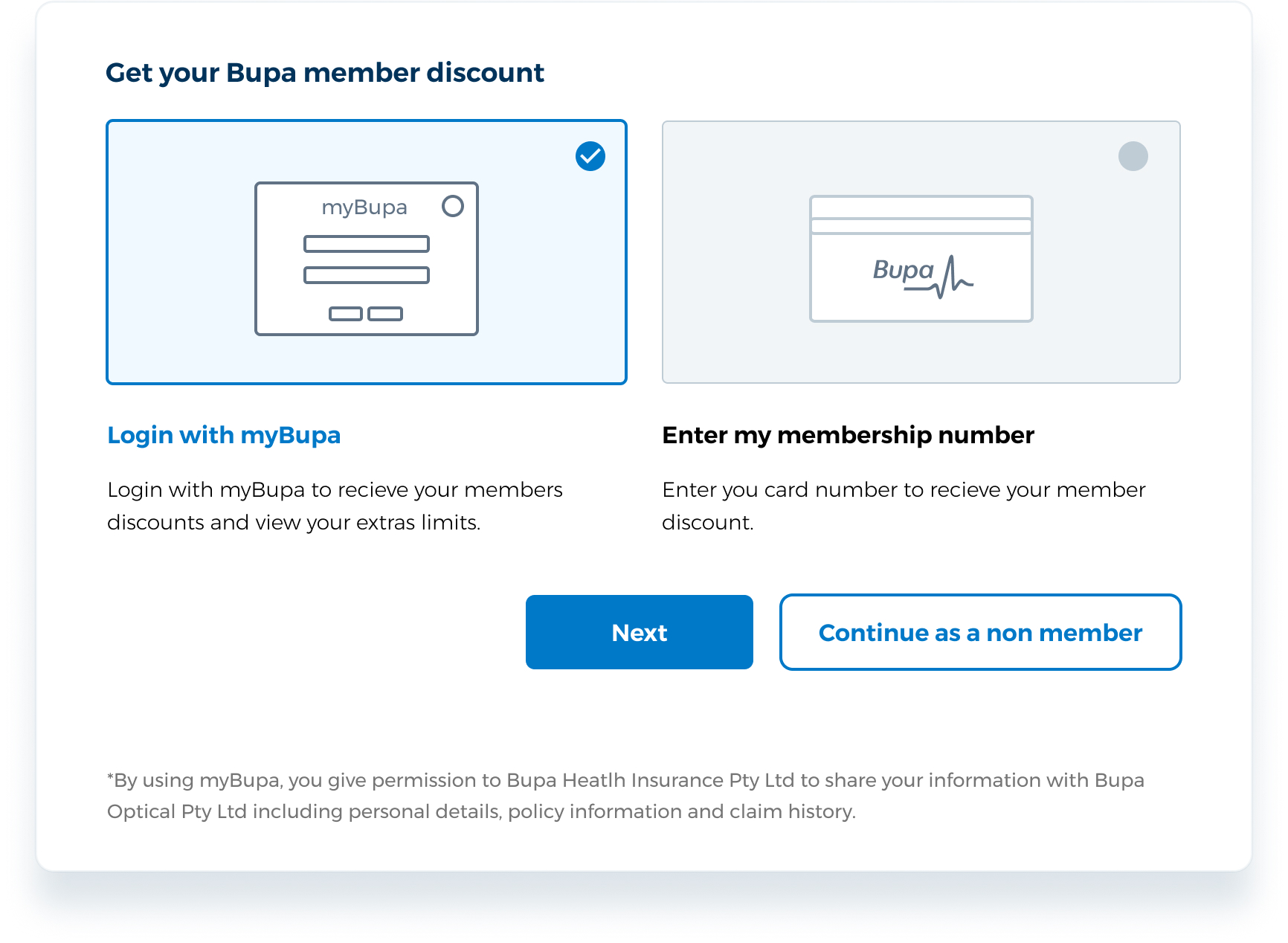
Customer did not read sentences
Visually attractive
Type B
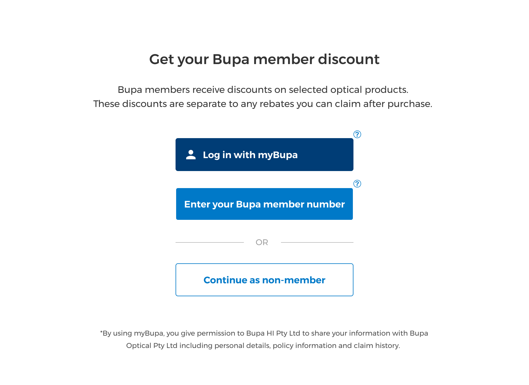
No difference between clicking two CTA
Simple and easy
Final pop-up modal
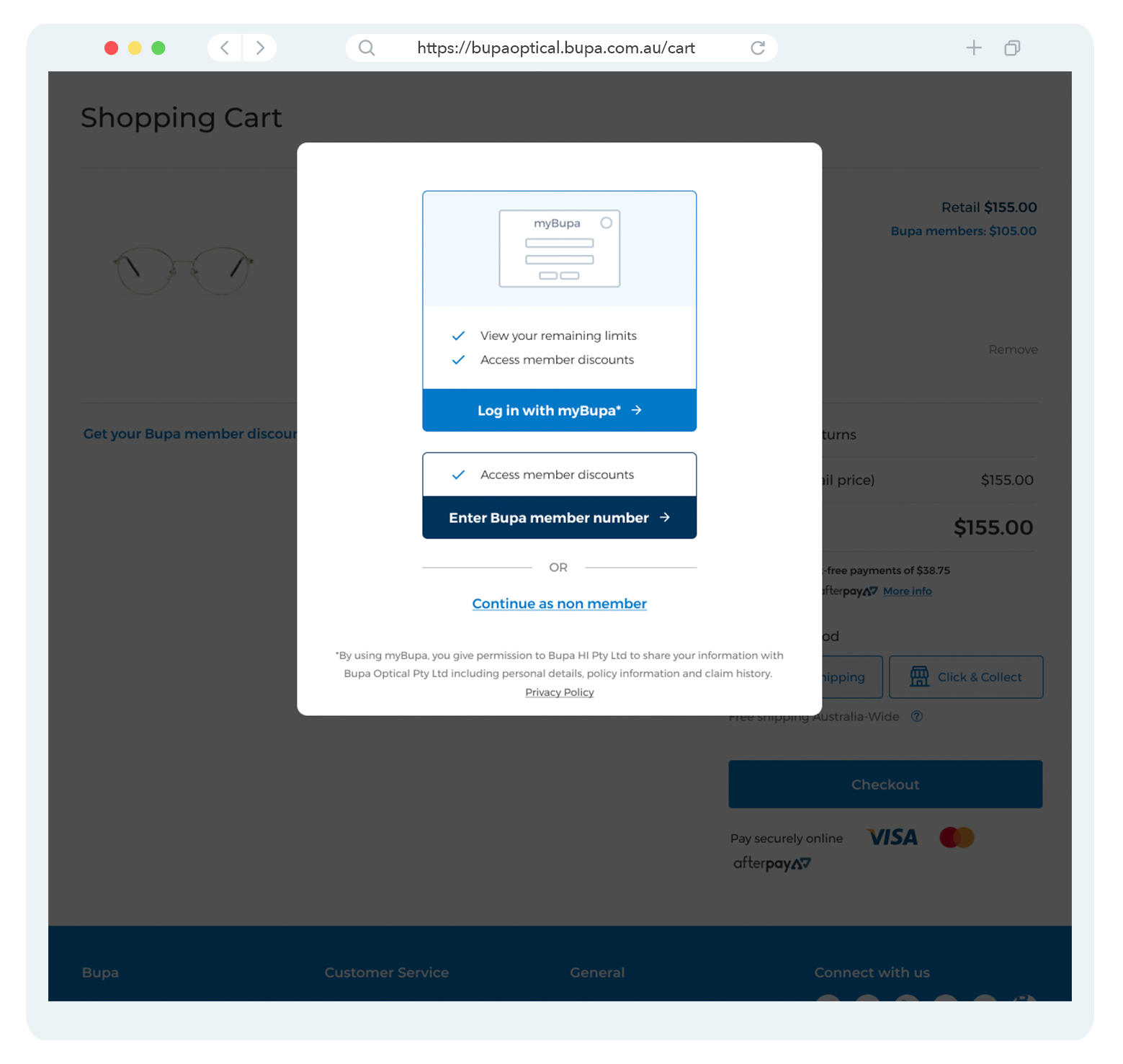
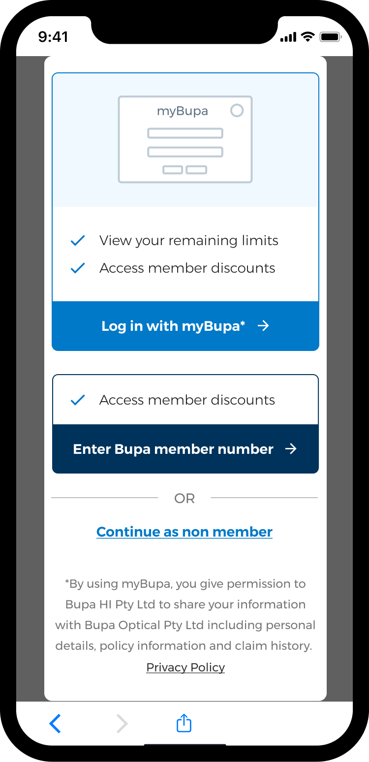
- Easy to comprehend the key difference between myBupa login & membership number login
- Clear copy articulates the key difference and benefit
- Visual emphasis on myBupa - visual modal preferential to users
- Mobile friendly
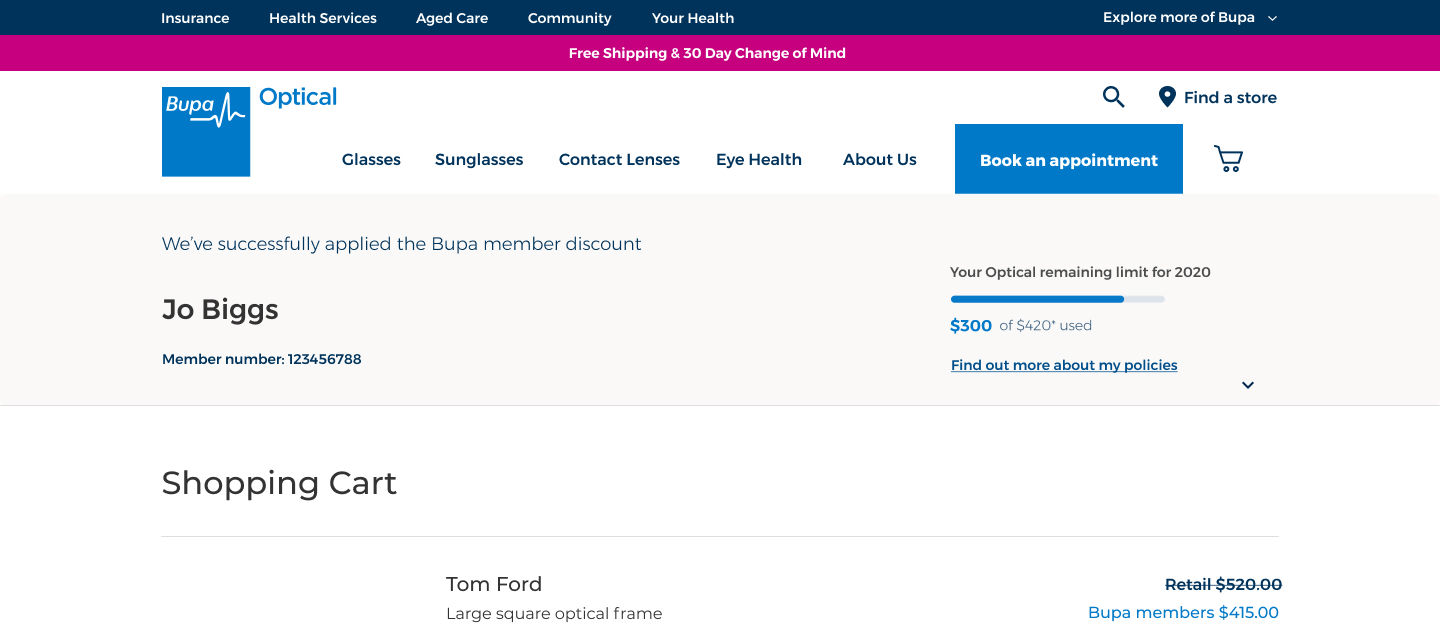
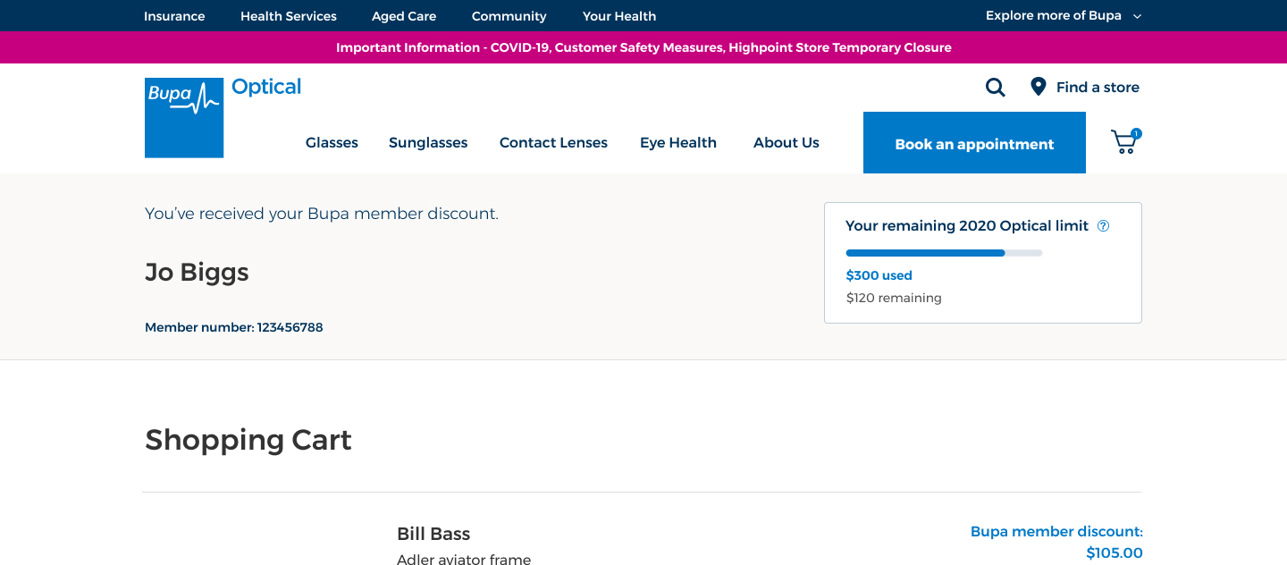
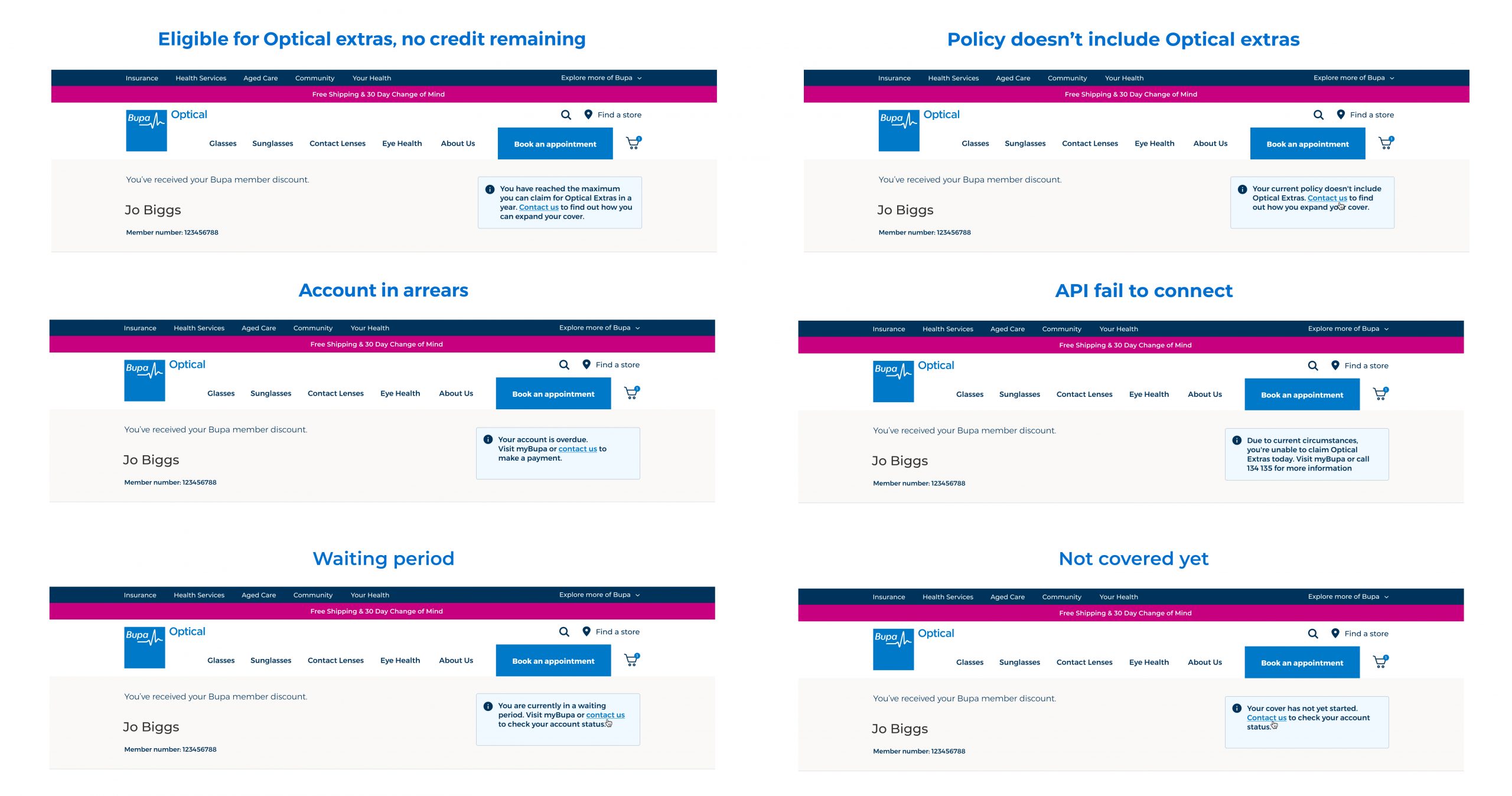
Remaining limits for myBupa members
First Iteration
Second Iteration
Edge Cases
Solution
After the feedback from the user testing and the stakeholders/legal team
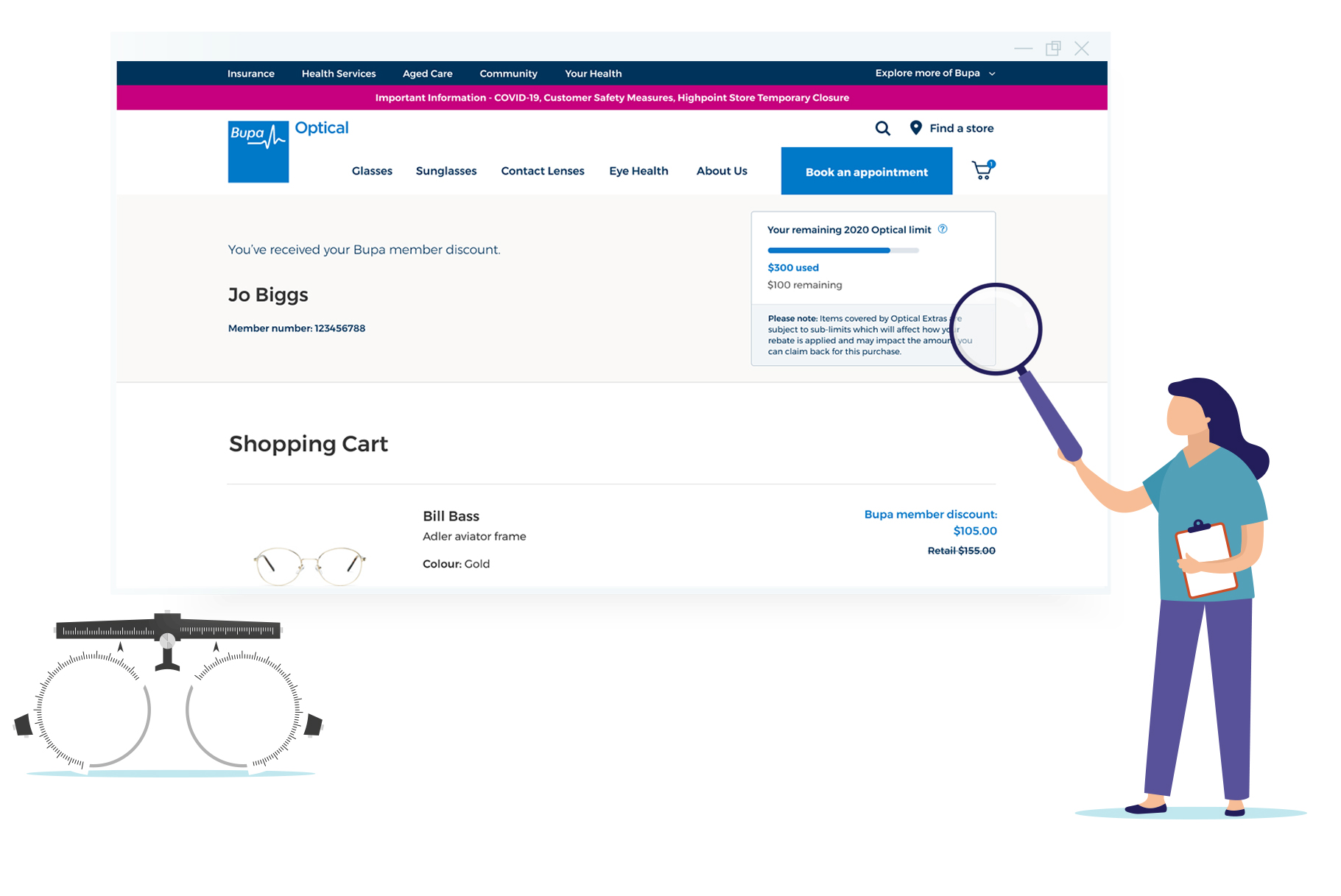
- Developed a modal for authentication at the cart stage using MyBupa APIs.
- Enhanced UX with clear, concise copy and visual hierarchy to highlight MyBupa benefits.
- Personalised Remaining limits including illustrative graph inherited style from myBupa
- Including legal copies - claiming conditions
Outcome
- Improved user comprehension of the login process and remaining limits.
- Increased login via MyBupa, enhancing the overall user experience.
Phase 2
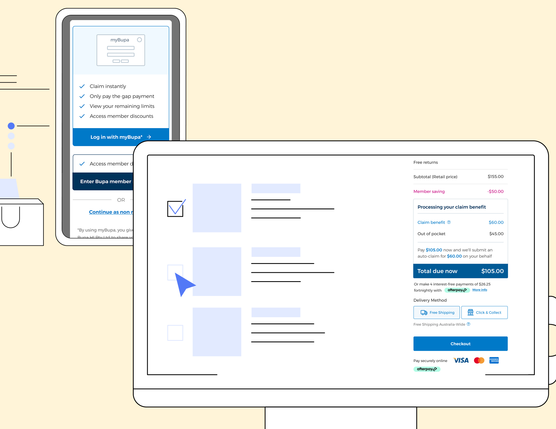
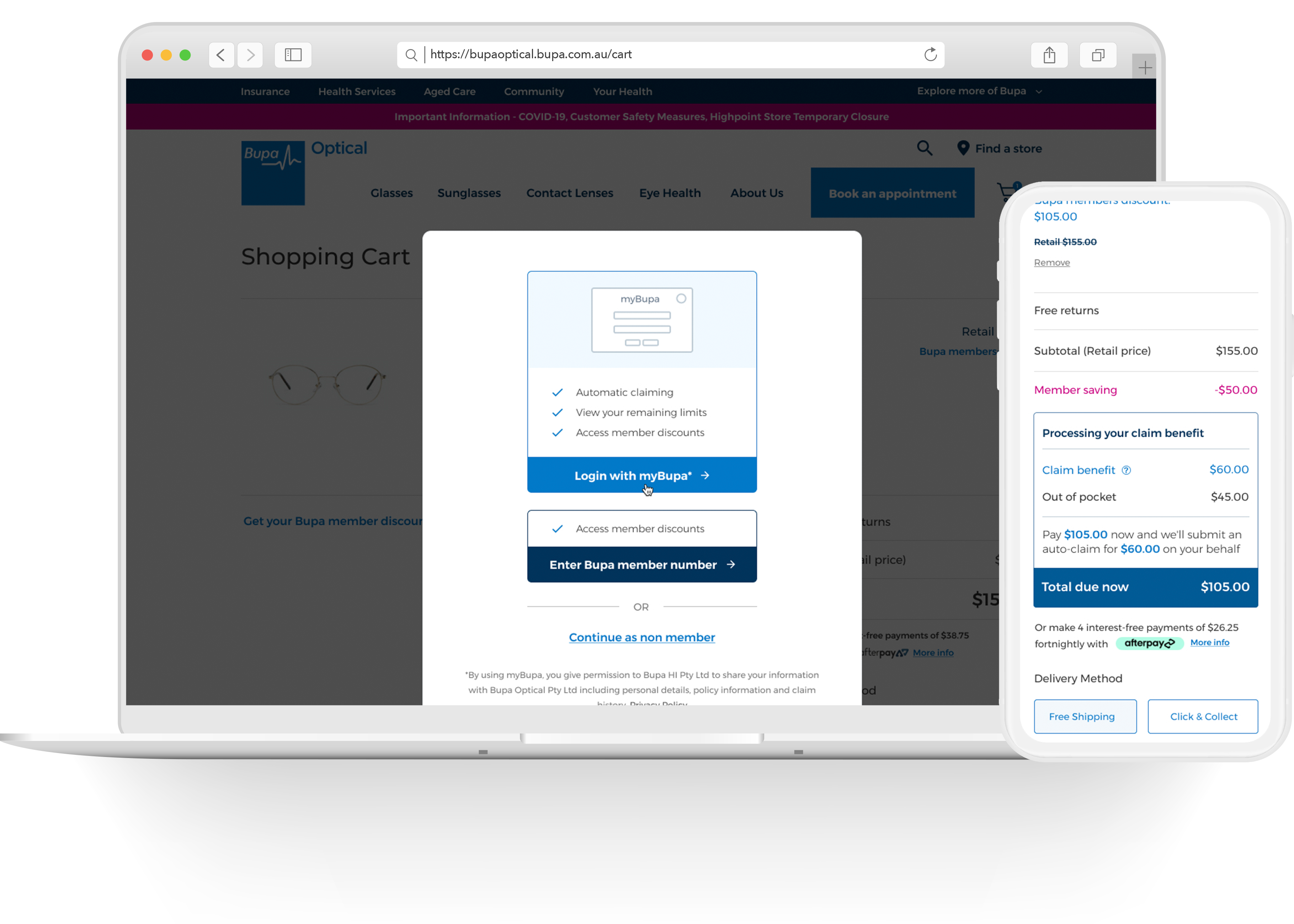
Personalised Pricing & claiming at checkout
Challanges


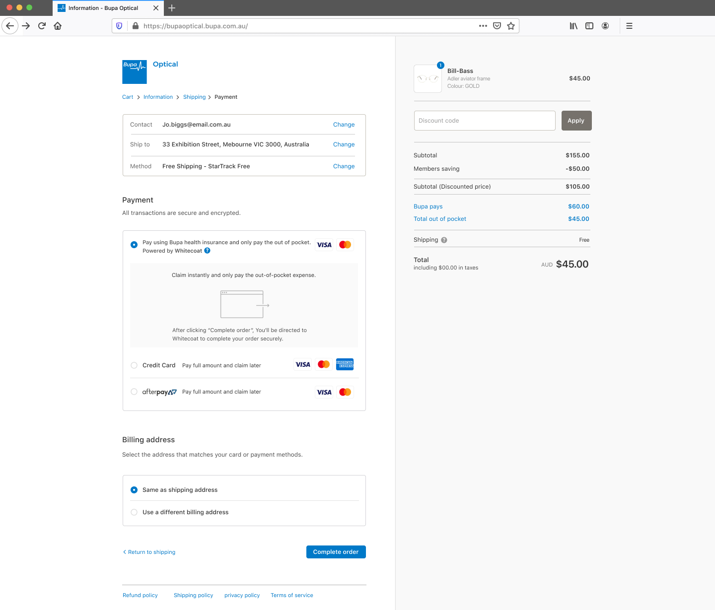
Auto-Claim Process using Whitecoat
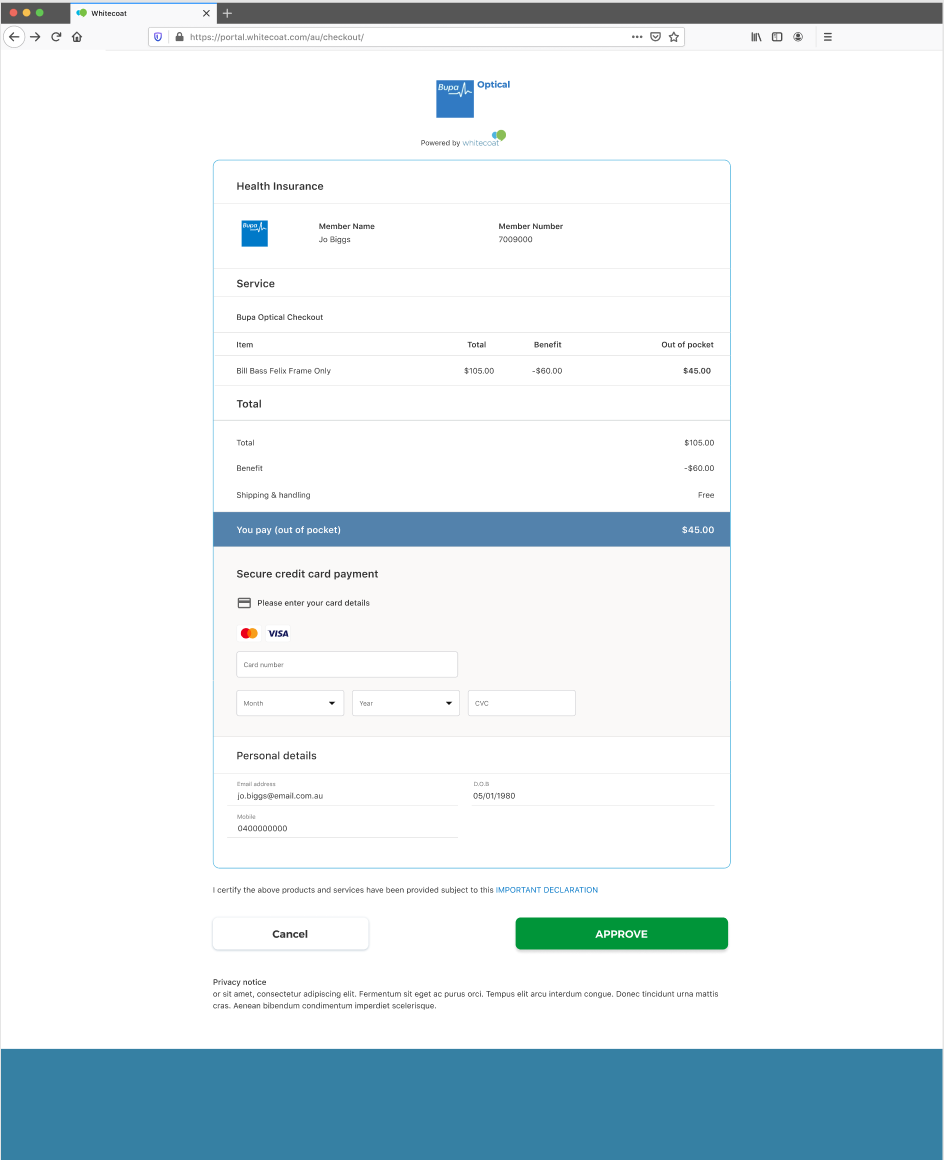
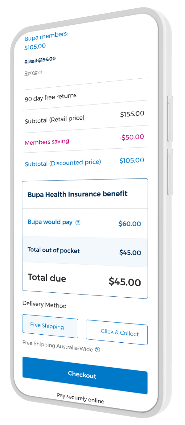
Initial concept failed
Strategy
The claiming process architecture using the MyBupa API differs from third-party plugins like Whitecoat.
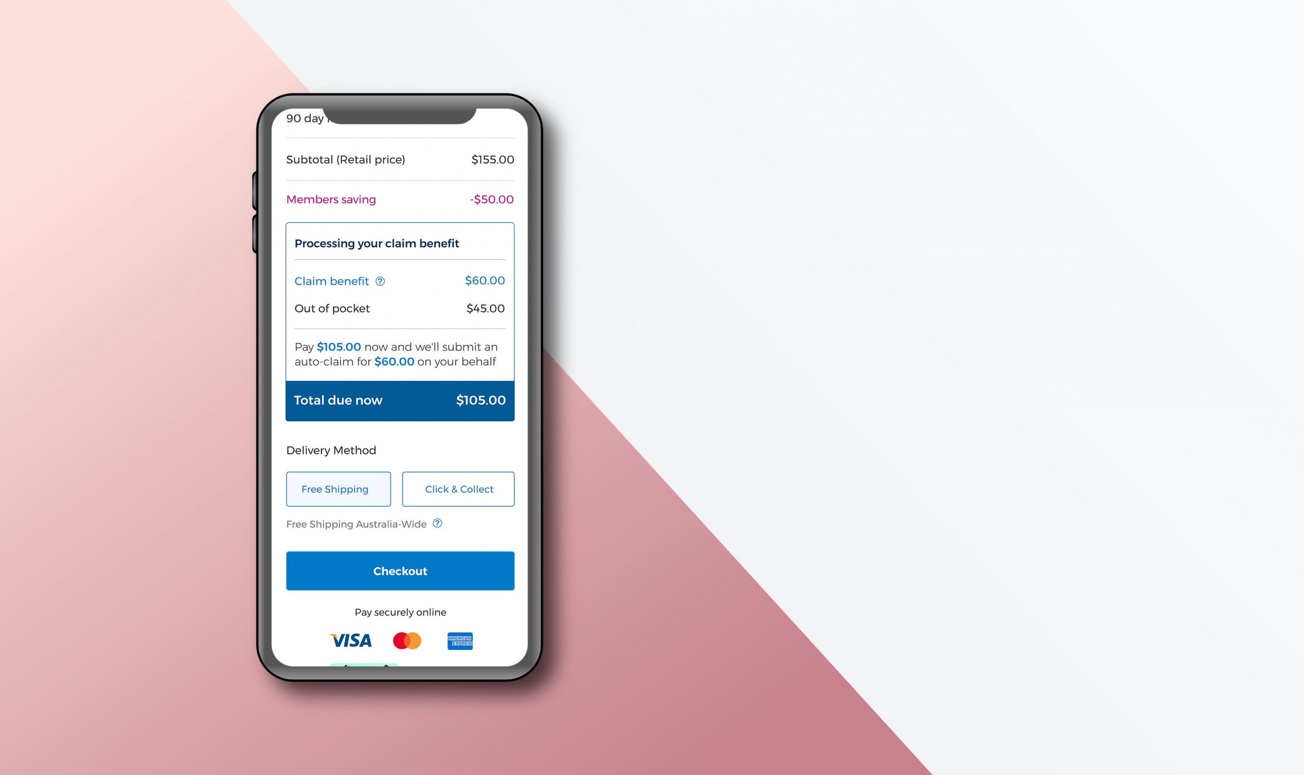
Personalised pricing works as follows:
- Customers pay the full amount upfront.
- Bupa Optical auto-claims the gap amount.
- The claim amount is refunded to the member's bank account within 2-3 working days.
User Research
After multiple iterations, we tested the top two styles with 12 customers and finalised the design solution.
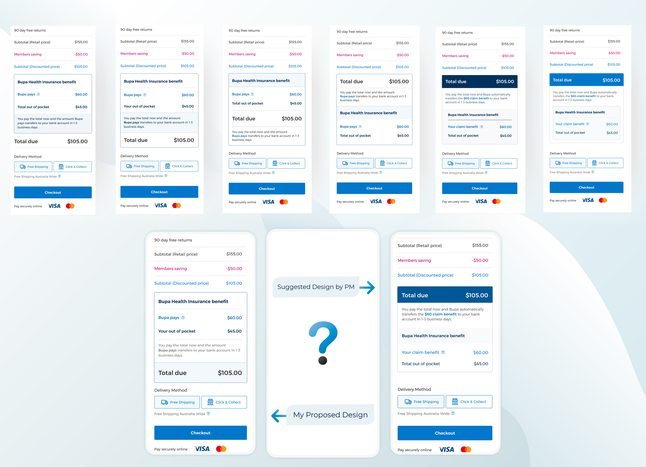
Decisions
Solutions
- Developed a pathway for auto-claims through MyBupa API.
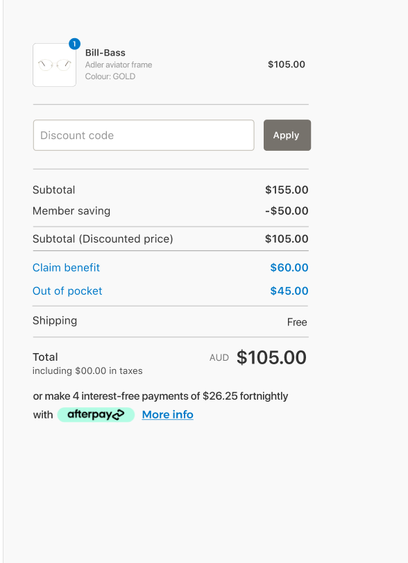
- Redesigned pricing sections to clearly highlight benefits and costs, ensuring visual clarity and sequence alignment with customer expectations.
Shopify Checkout - integration with myBupa API
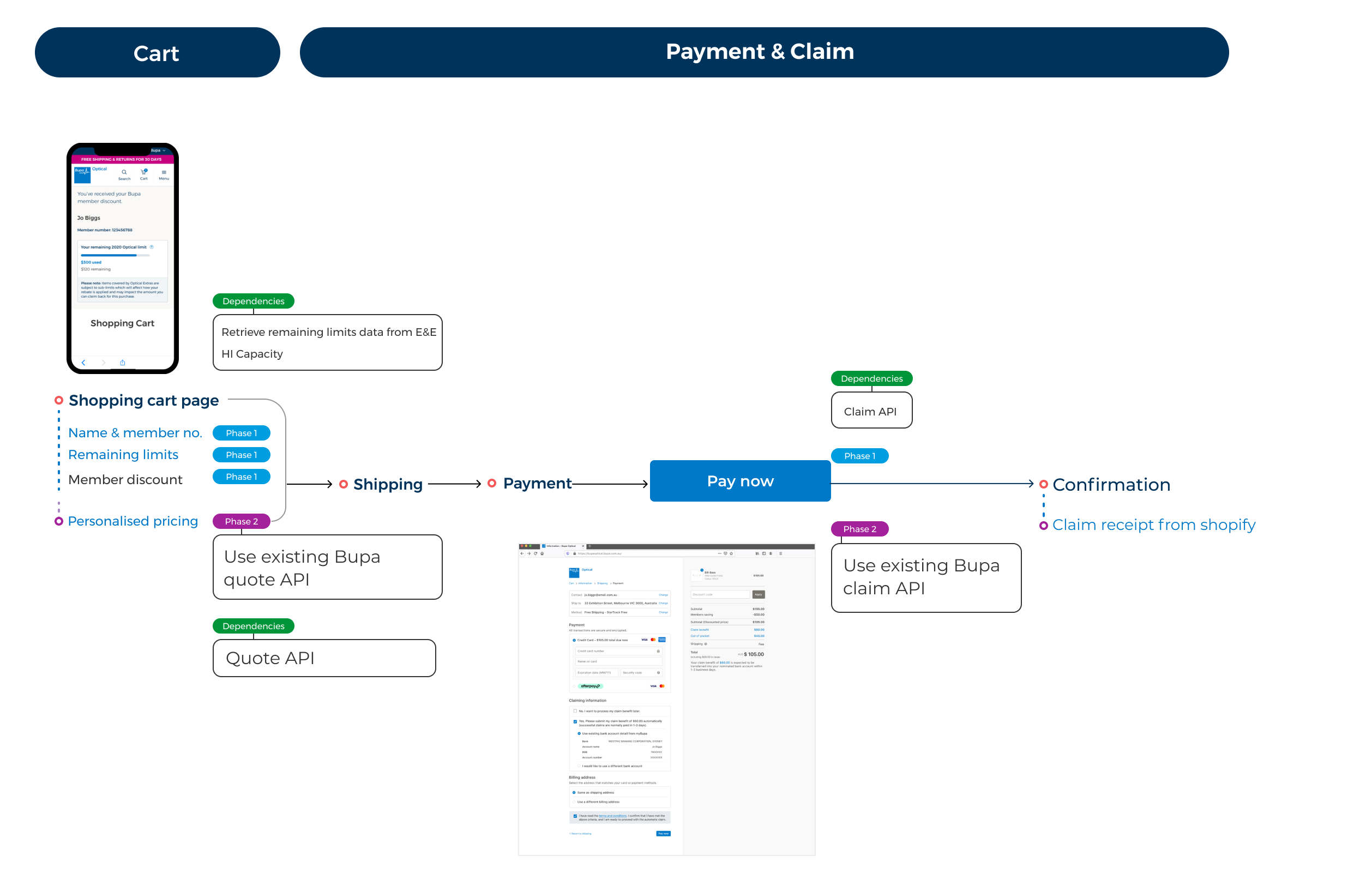
Design Requirements
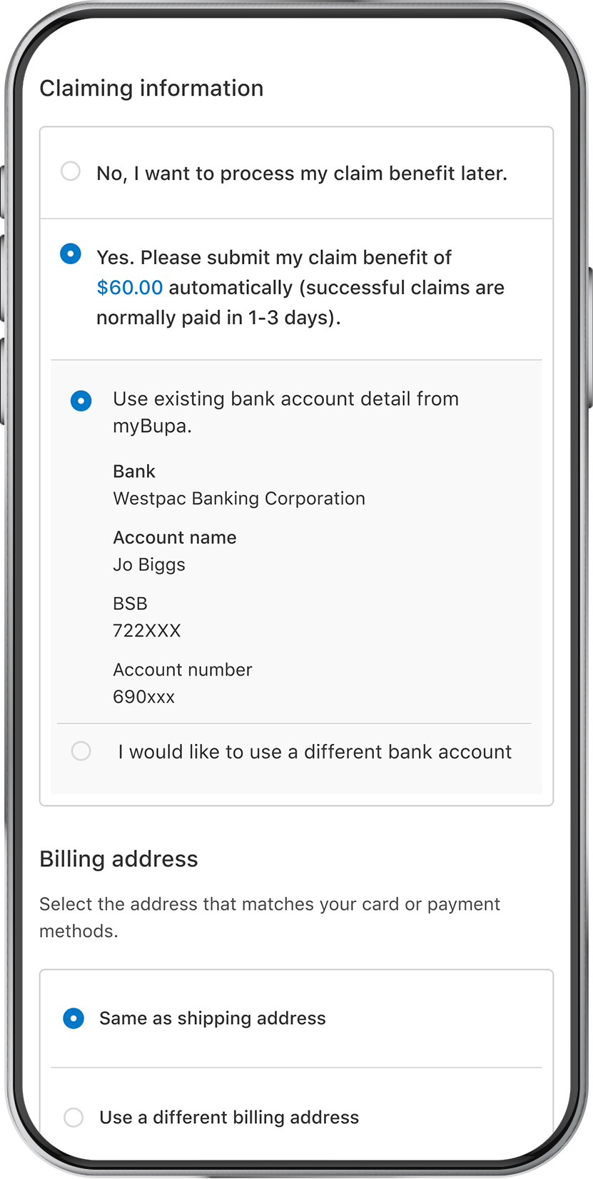
- Happy path - the customer either has a nominated bank account or no bank account details stored in myBupa.
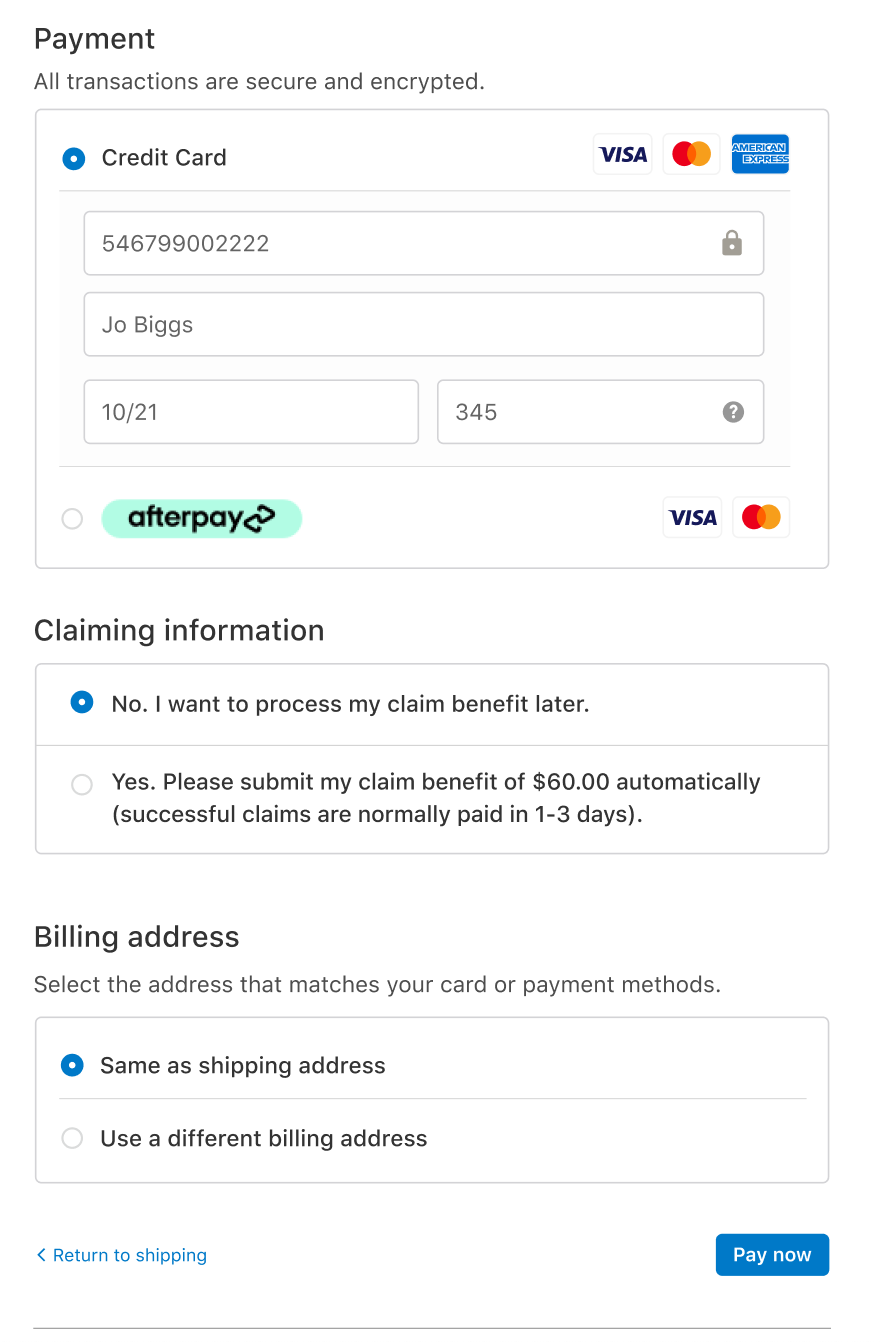
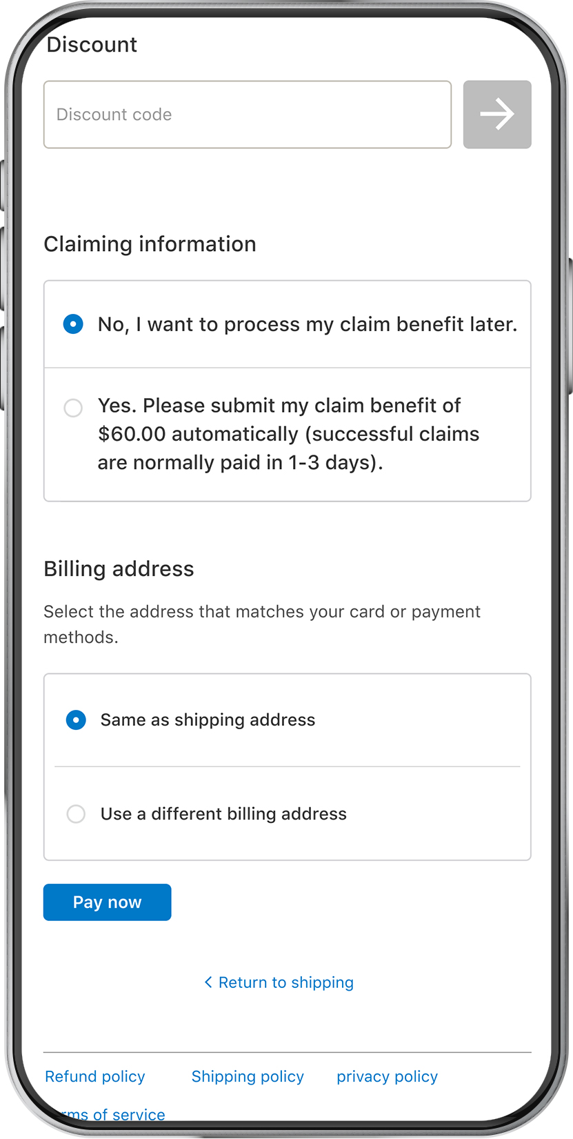
- Manual path - the customer opts to claim later.
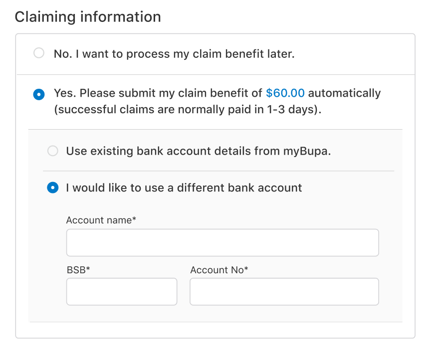
- Error state - an API error occurs during loading, or the customer opts to use a different bank account.
Claiming Information
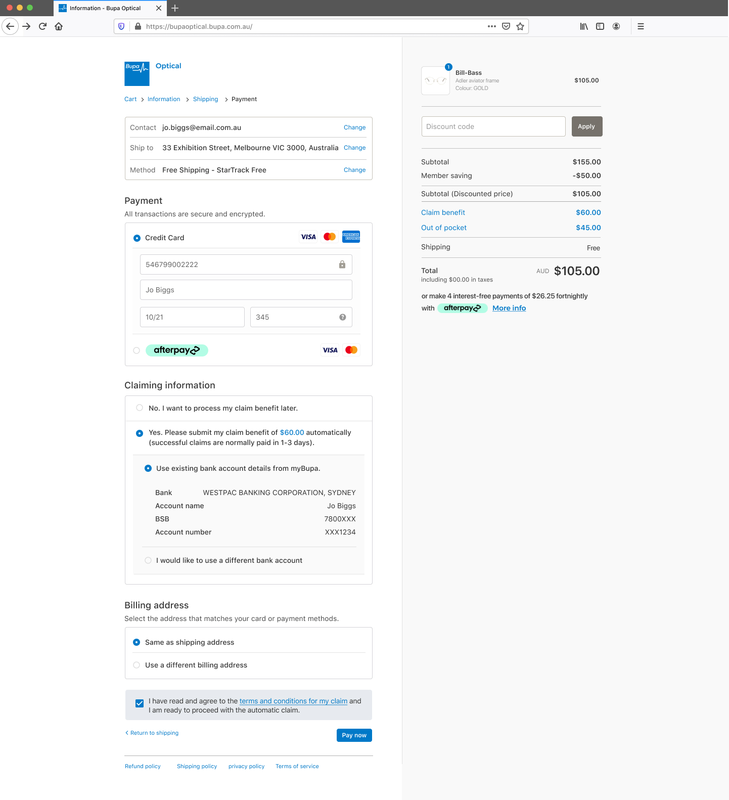
- User has a nominated bank account
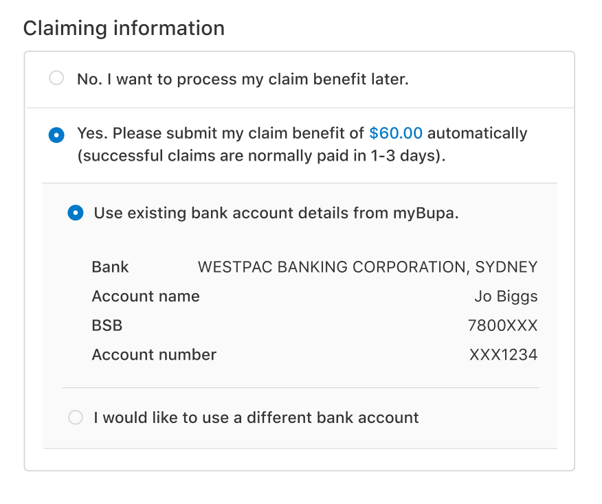
- User wants to use a different bank account
- Cost summary breakdown, including out-of-pocket expenses and claims.
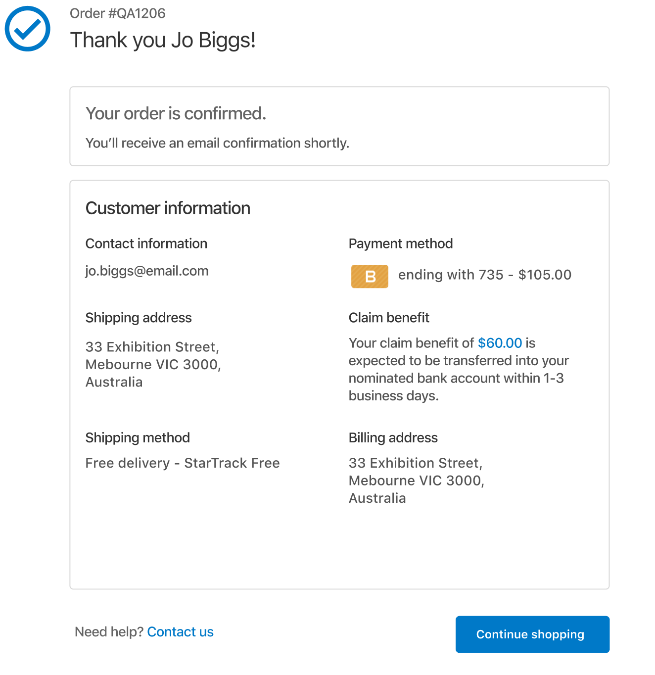
- Updated and added claim benefits to the summary of claim and purchase.
- The user chose to claim manually
- Summary of choosing the manual claiming process
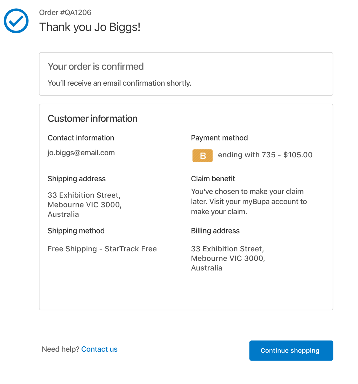
Mobile Responsive
No bank account saved
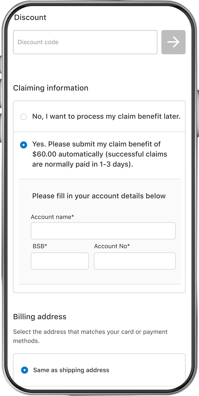
Manual bank acc options
Claim later manually
Outcome
- Customers gained clear insights into costs, encouraging purchases.
- Increased adoption of MyBupa for claiming and checkout integration.
Phase 3
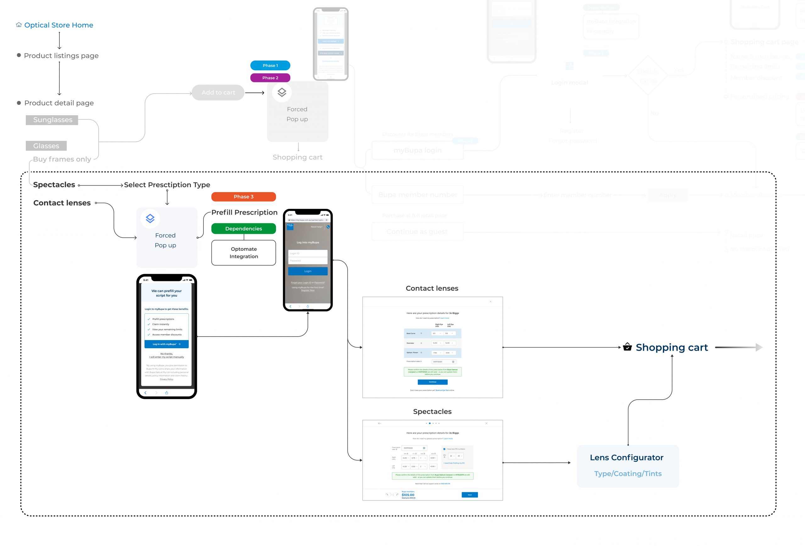
Pre-fill prescription for Buy with lenses & Contact lenses
Improving product detail page
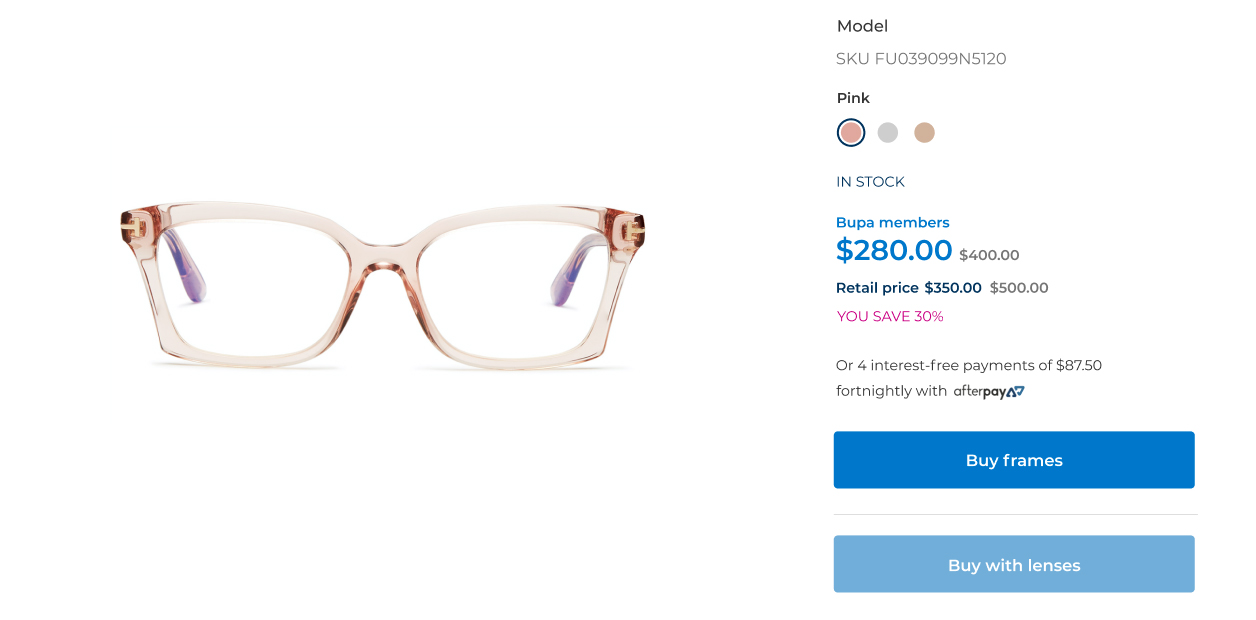
- Before
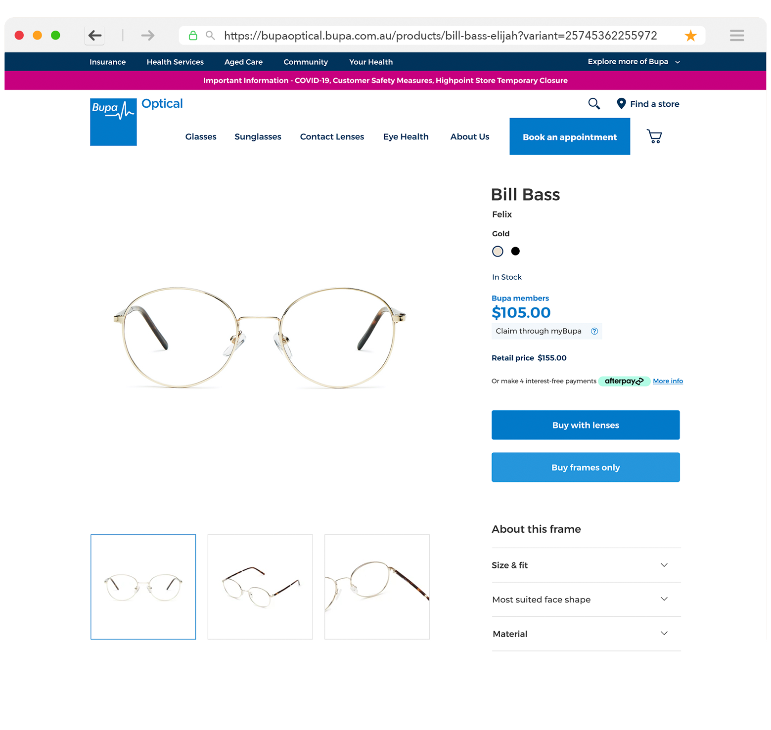
- After customer testing, we found that the "Buy with Lenses" button should be more prominent, as customers typically prefer products with lenses. We prioritised this option as the first touchpoint. Additionally, the term "Buy frames" was unclear, so it was changed to "Buy frames only."
Contact lenses product detail page
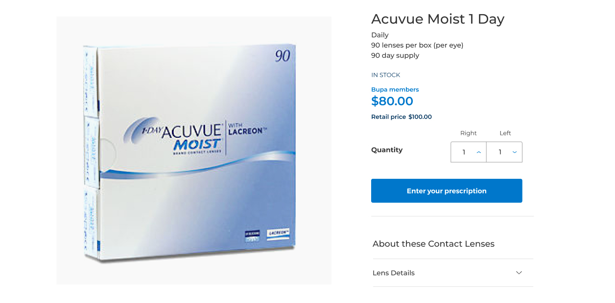
- Before
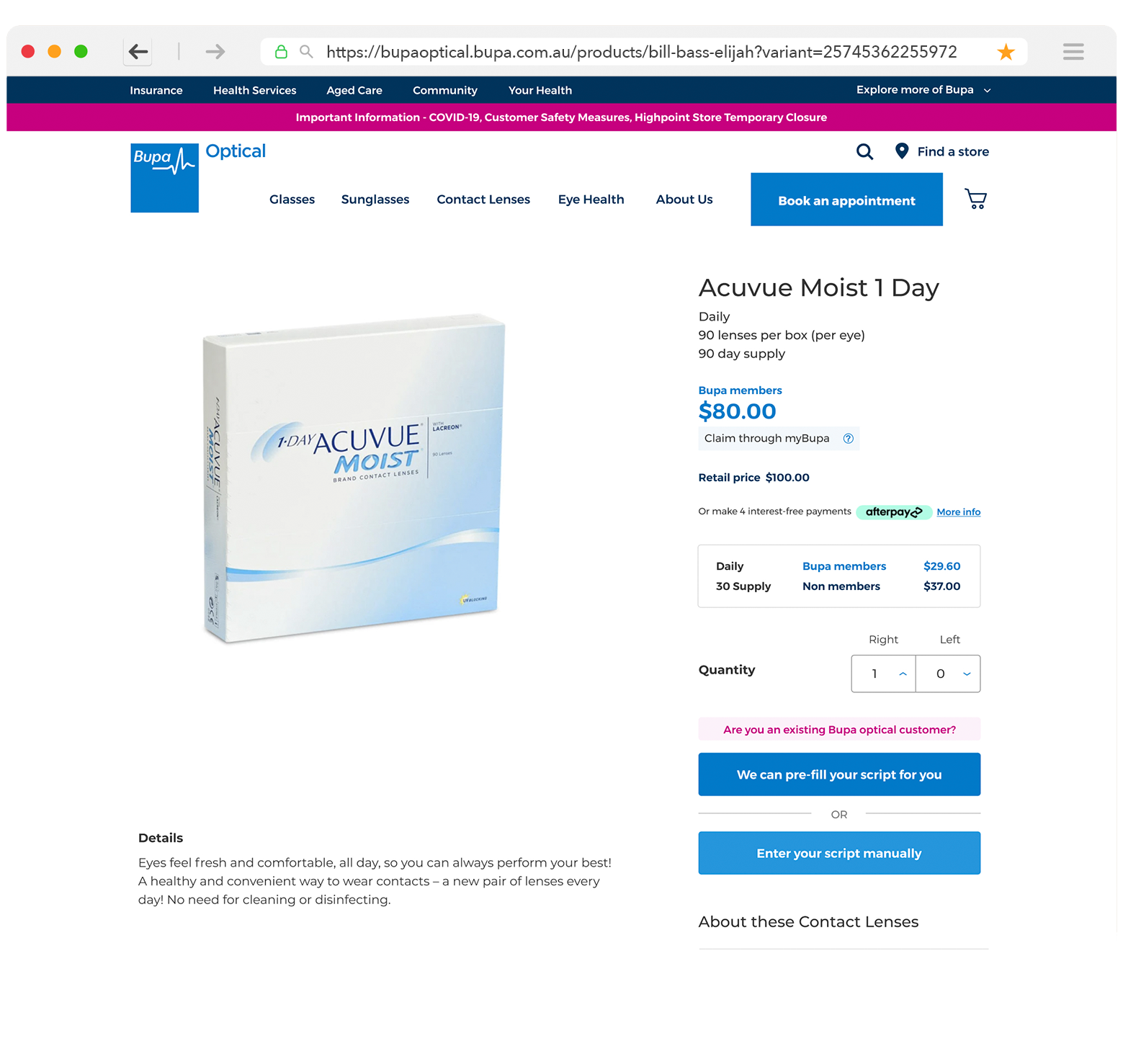
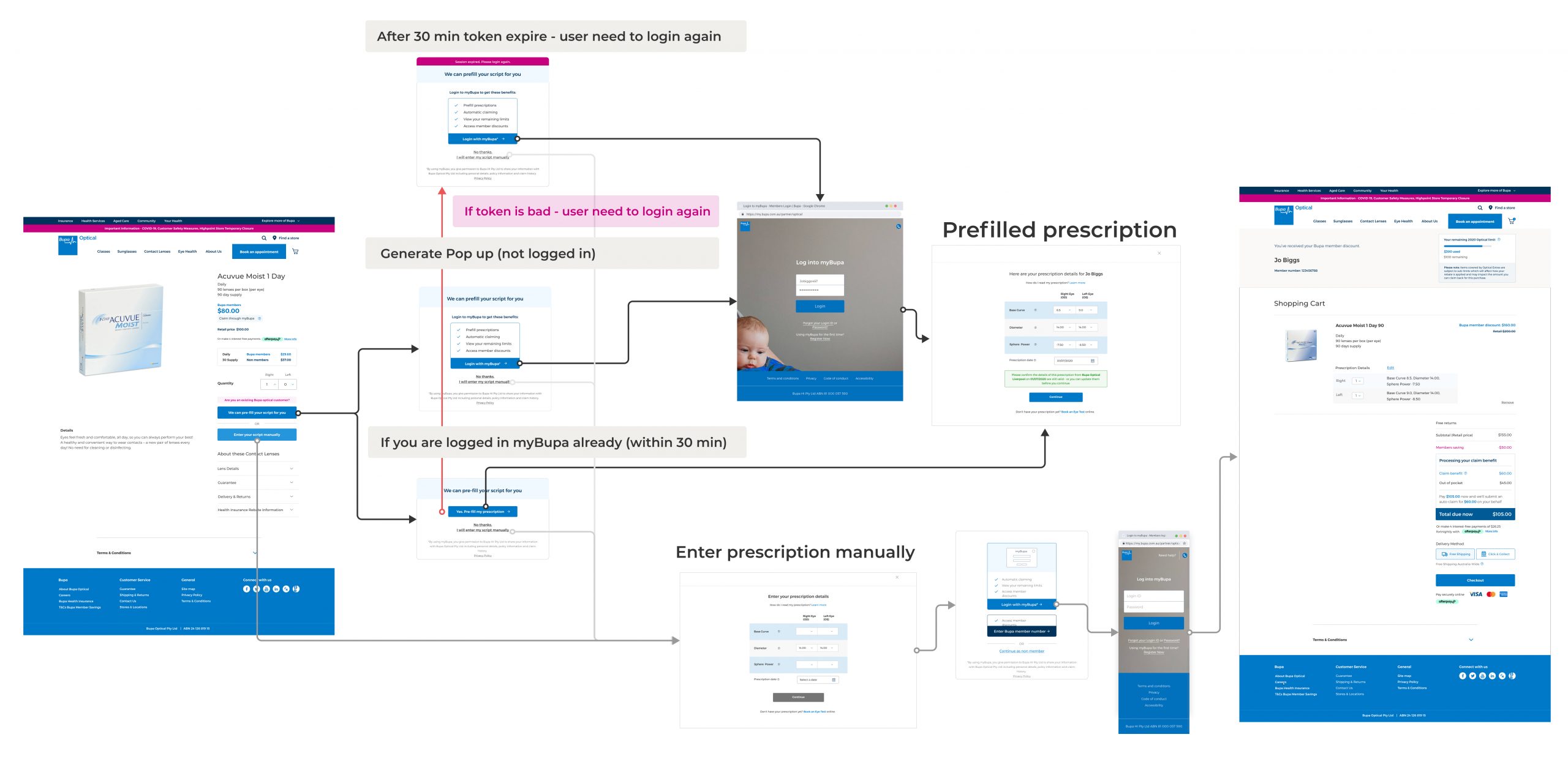
- Optical Bupa currently lacks login/logout functionality and does not sync with the main domain for SSO. However, we pass myBupa login info to the optical site via a popup modal, allowing customers to validate their membership details. Previously, manual script-based purchases raised concerns about errors, making customers hesitant to order online. To simplify the process, we introduced pre-filling functionality. I added a button to prompt users to initiate the login process, leading to the pre-filling step. This self-explanatory approach was well understood, with the majority of customers choosing the myBupa pathway.
Buy with lenses user flow
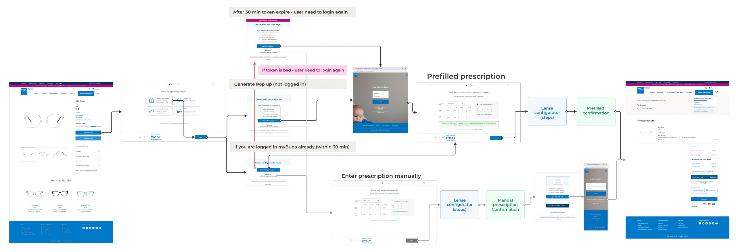
Design Requirements
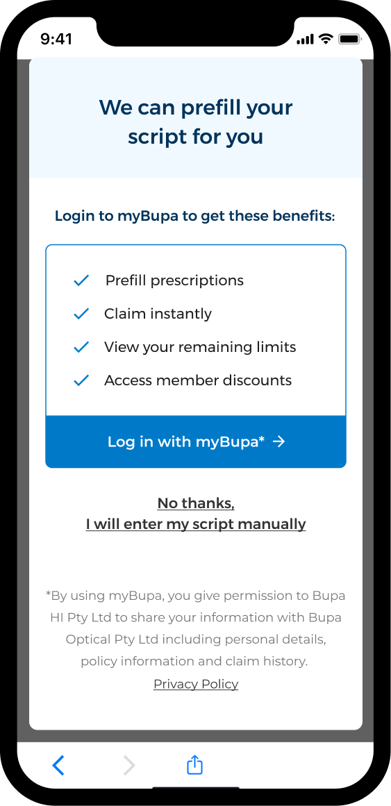
Prescription Modal
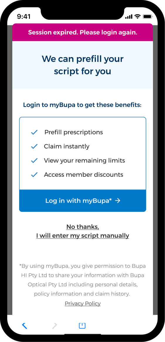
Session expired
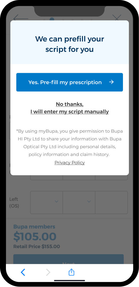
Customers already authenticated
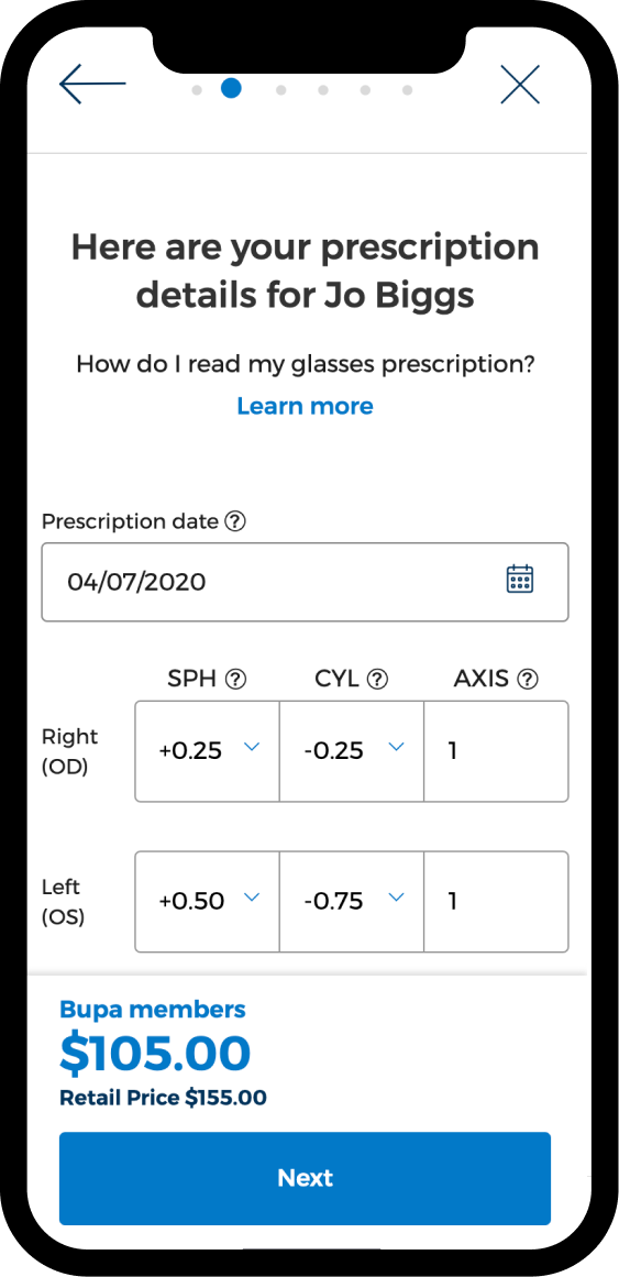
Prefilled Prescription
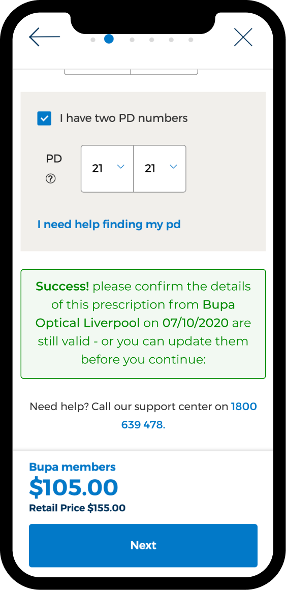
Prefilled Prescription
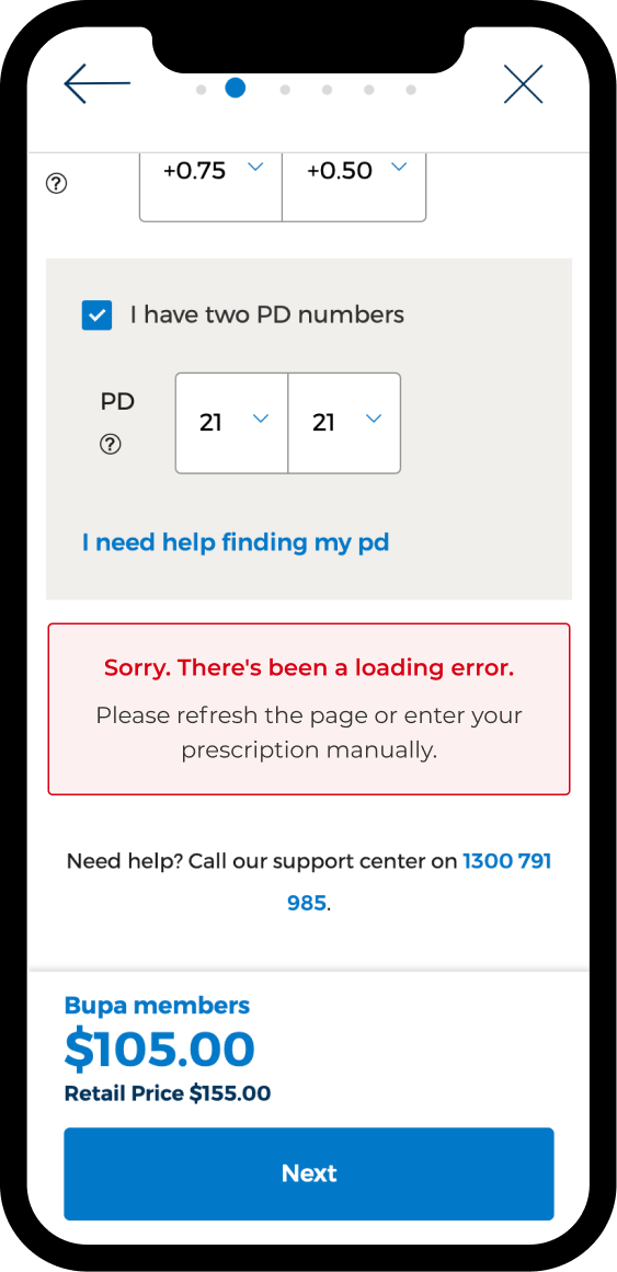
Error state
Outcome
- Customers could pre-fill prescriptions with one click, significantly reducing friction in the purchase process.
- Improved conversion rates and streamlined the online shopping experience
Results

