Conversational AI Web Application Product Design Lead
Strategy Product thinking Сustomer experience Interactions design Design System Leadership
Conversr is a robust conversational engagement and campaign management platform built for automated, two-way SMS communication. It streamlines and enhances manual SMS interactions for operators. I led the UX/UI design from the ground up, transforming a non-existent interface into a user-friendly SaaS platform that solved key user challenges and simplified the entire experience.
Problem Statement
Users face significant challenges in managing campaigns and creating contact lists within Conversr, including the inability to edit or delete campaigns, a cumbersome setup process for contact lists, and reliance on the ops team for support. These issues limit flexibility, autonomy, and efficiency, creating friction for users.
Goal
Design an intuitive front-end for Conversr within the Burst SMS platform, enabling conversation managers to create and launch conversations effortlessly. This solution streamlines campaign management, enhances self-service, and improves customer support efficiency.
By simplifying conversation creation, it drives migration from Protobot to Conversr, equips Sales with assets to showcase value, and reduces internal team overhead.
Automation: Automated contact list creation reduces manual dependencies and errors.
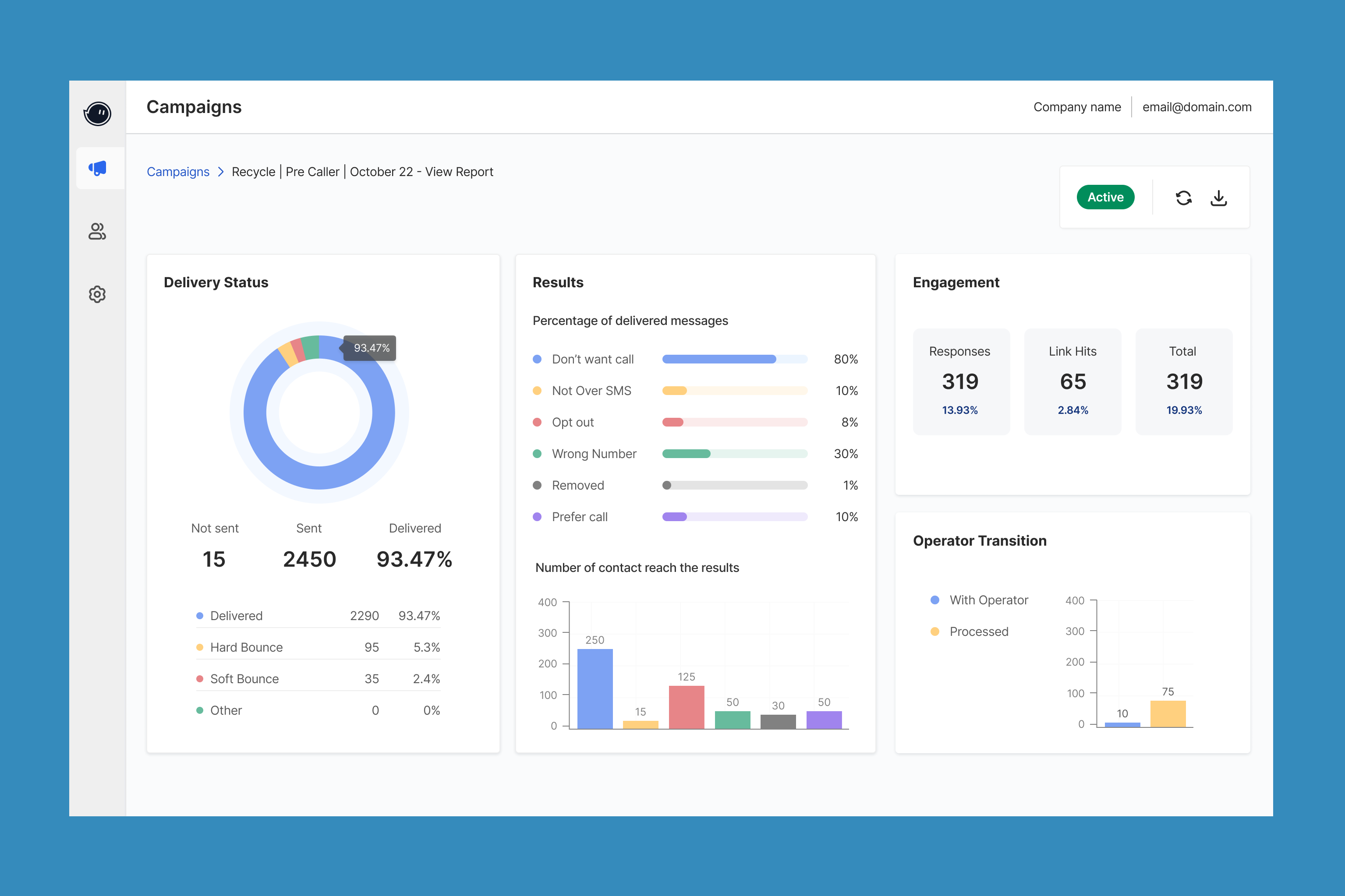
Data-Driven Insights: Interactive dashboards and analytics enable actionable decision-making.
Self-Service Capabilities: Simplified workflows empower users to operate without reliance on support teams.
Customer Impact
Efficiency Gains: Campaign setup times reduced significantly, with manual intervention minimized.
Improved Usability: Enhanced user experience with intuitive workflows.
Actionable Insights: Empowered users to make data-driven decisions through relevant, visualized reporting.
Increased Engagement: 75% dashboard engagement rate, with users interacting with campaigns at least 5 times on average.
Ideation & Design Evolution
These early explorations helped stakeholders envision future possibilities and alternative designs beyond the MVP, while the simplified version clarified the Dove design system’s color scheme, icons, and overall look and feel, laying the foundation for cohesive UX/UI in the final SaaS product iterations.
Next Step
After revising and reviewing with engineers and the product manager within my team, we began to refine the scope for the MVP, focusing on building the final design for Phase 1 development.
Expectation
By enhancing the user experience, transitioning from Protobot to Conversr will be effortless for customers, ensuring a smoother and more enjoyable journey. This upgrade not only improves customer satisfaction but also boosts efficiency for internal teams, reducing manual API tasks and enabling more streamlined operations. The solution delivers a win-win, benefiting both end-users and internal workflows.
Phase 1
MVP Development
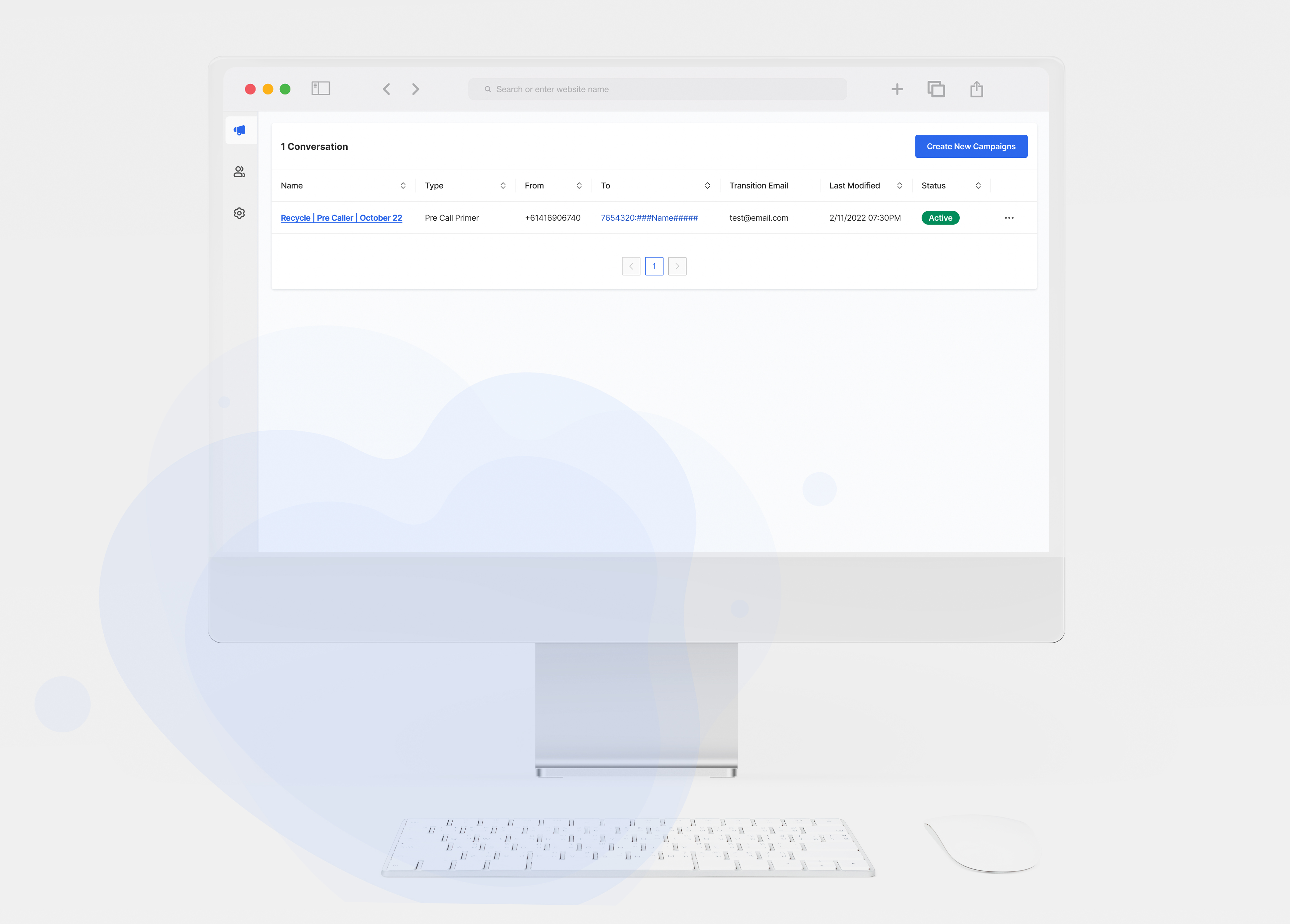
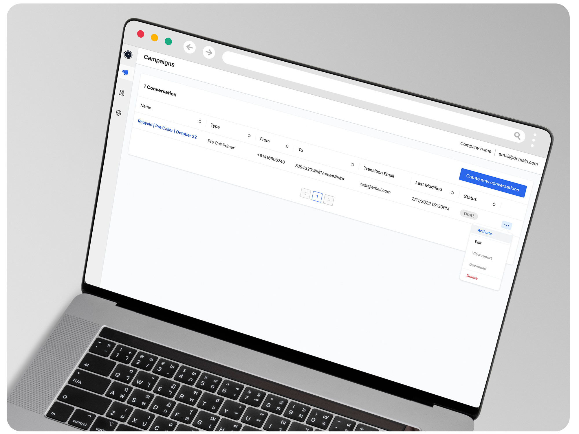
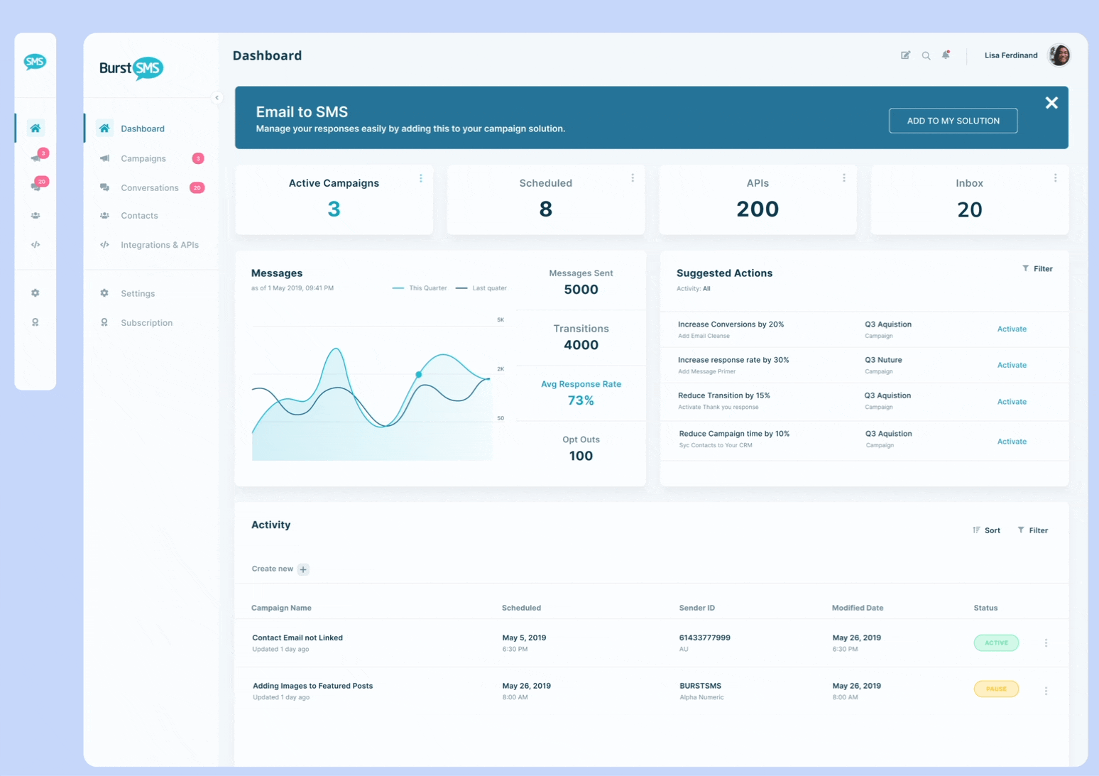
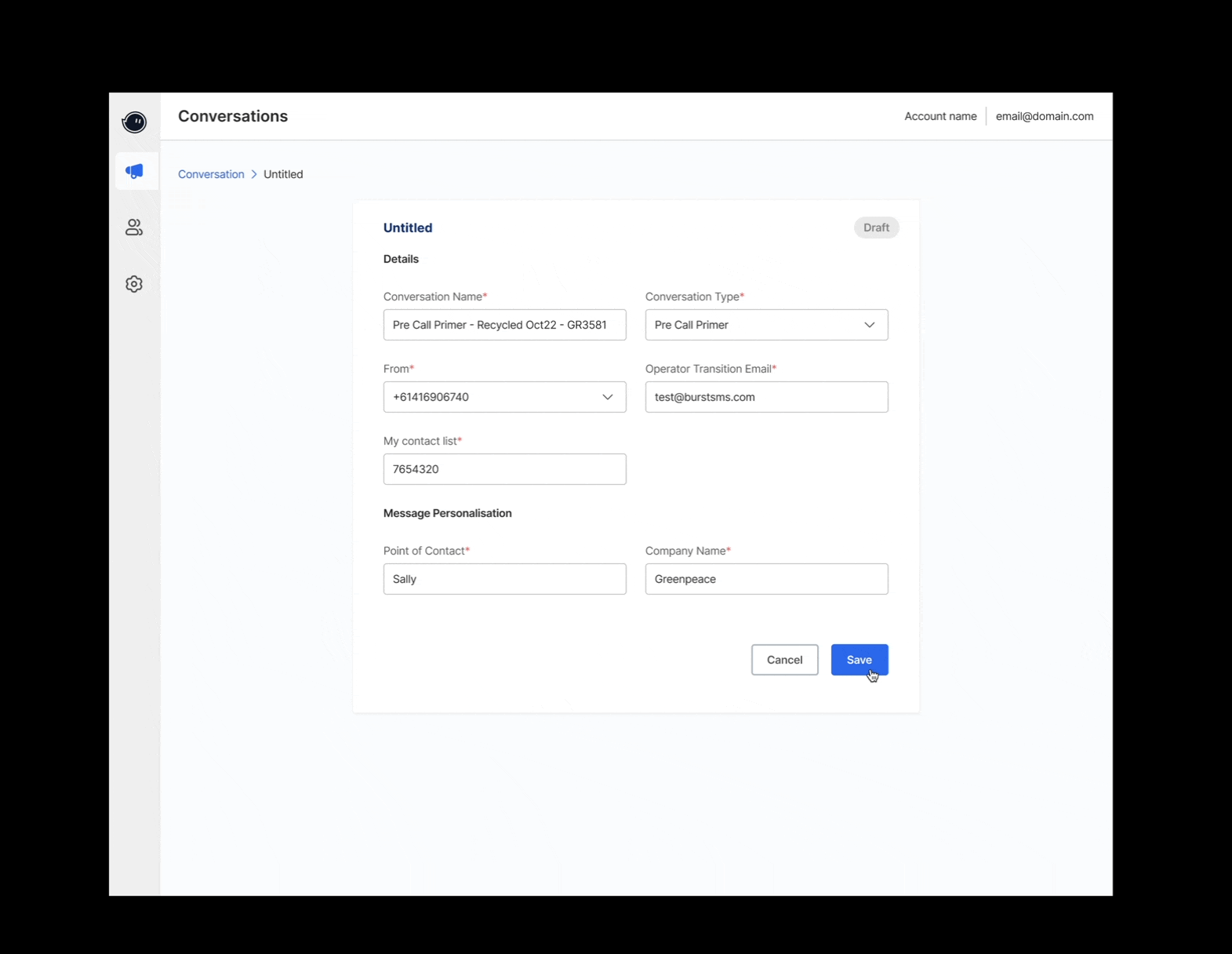
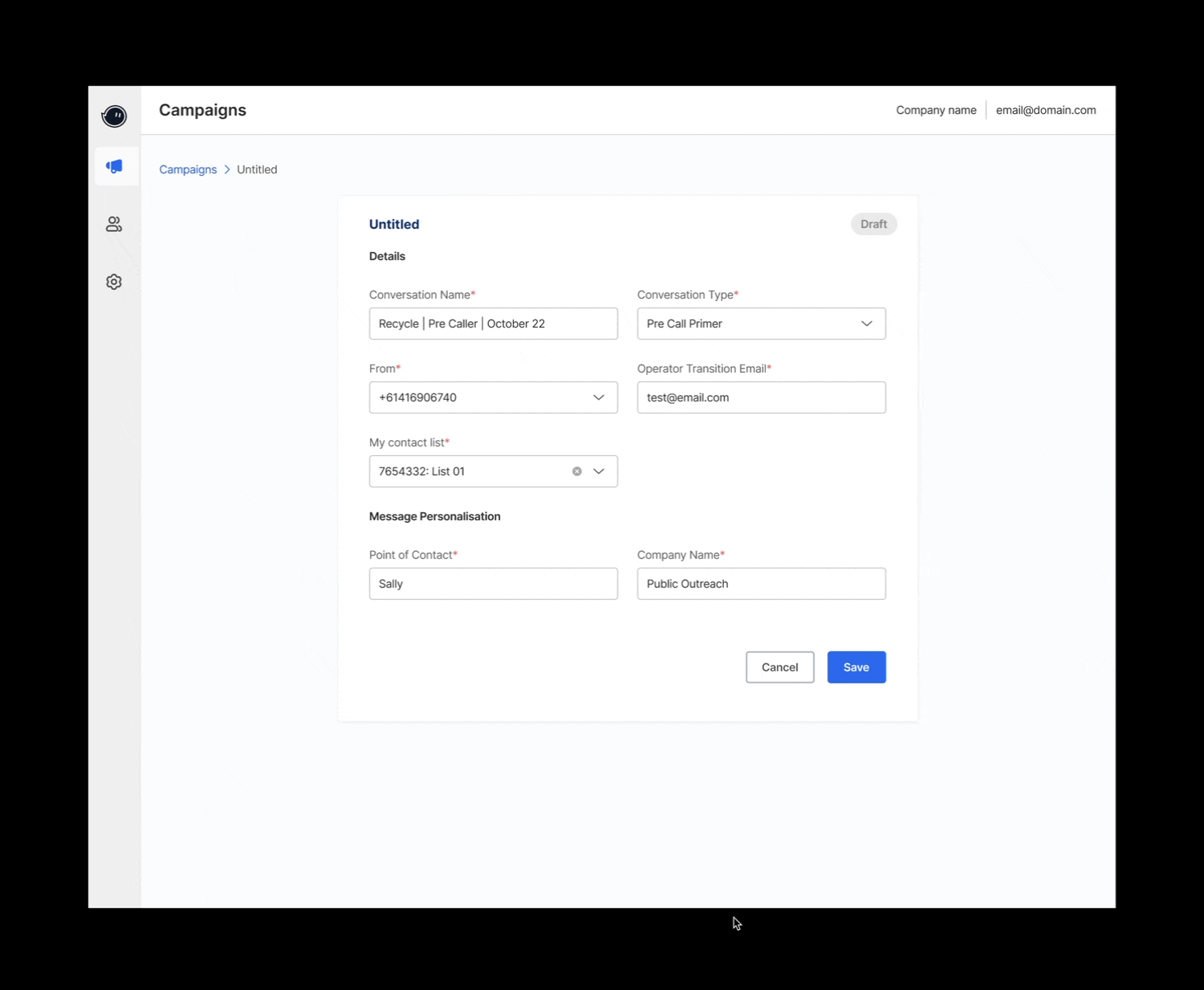
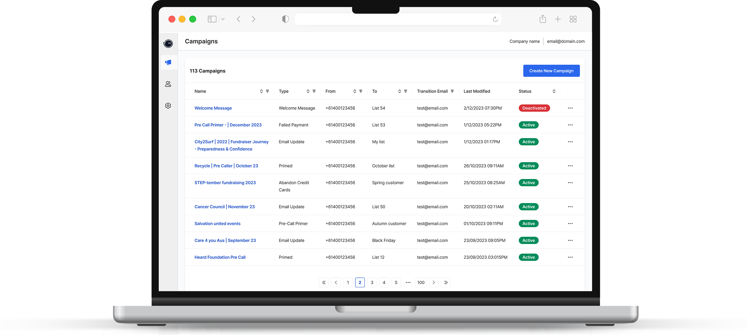
Led the development of Conversr’s UI from the ground up, seamlessly integrating essential features such as campaign creation, editing, saving, and activation/deactivation.
Developed all assets using the Dove Design System, including patterns, icons, and components. - Created a new navigation UI for a unified ecosystem.
Streamlined campaign creation and editing with clear error states for better user guidance.
Research
Post-launch Feedback
After the Phase 1 launch, we evaluated the MVP to pinpoint areas for improvement. While user testing wasn’t feasible during the initial release due to tight timelines, client testing was conducted post-launch. Collaborating closely with engineers and product managers, we prioritised rapid iteration to meet deadlines while addressing user testing constraints.
Due to project timelines, user testing wasn't conducted during the initial MVP (Phase 1) release.
This process revealed gaps in navigation, terminology, and feature usability, which informed subsequent refinements.
Outcome
A functional MVP launched with a refreshed design system and essential features.
Phase 2
Refinement & Reporting Enhancements
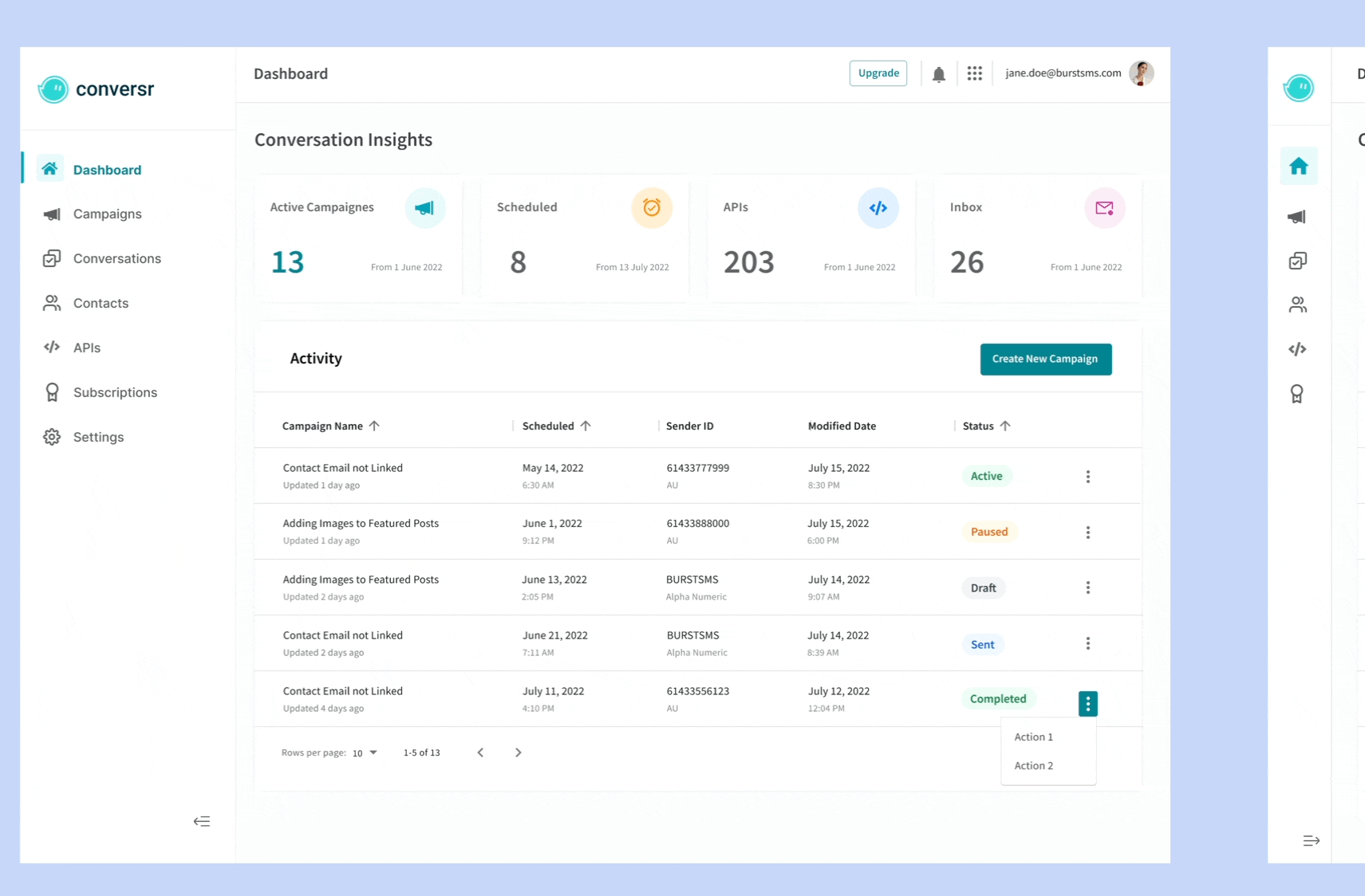
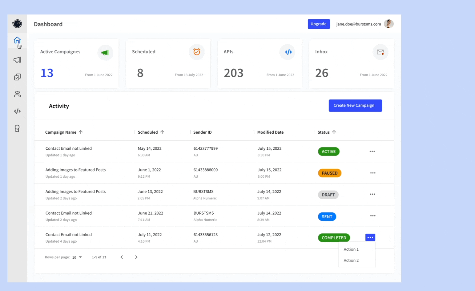
The design focused on creating an intuitive experience by streamlining campaign creation and editing, enhancing visual reporting dashboards with customisable filters, and ensuring clear and concise error states for better user guidance.
Focus
Led Phase 2 of a UX overhaul, delivering streamlined workflows, intuitive navigation, and advanced reporting tools including customisable date filters and visual analytics while iterating on Phase 1 feedback to create a polished, user-centric experience.
Problem
The main issue is that the Conversation Manager needs to quickly review conversation statuses and take action when necessary. However, the current process of exporting and analysing data is slow, doesn’t offer clear summaries, and lacks the ability to act directly within the system based on the insights. The key new requirement is:
Summarised Insights – Provide clear, concise conversation status summaries for quick review.
Real-Time Data Access – Eliminate the need for exporting data by integrating live insight
Performance Optimisation – Speed up data processing and display for faster decision-making.
Research Process
Formal Usability Testing
Conducted 1 round of moderated user testing with 5 participants (45 minutes each).
Users appreciated visual reporting but found some stats irrelevant.
Terminology caused confusion in some areas.
Dropdown inconsistencies disrupted the user experience.
Key Recommendations
Consistent Menus: Make menu options the same across all sections for better user experience.
Clear Labels: Use simple, standardised labels on forms and reports to avoid confusion. Add helpful tips or explanations where needed.
Better Search: Improve the search feature to make it easier to find what users need quickly.
Refined Design MVP 2
Addressed Phase 1 feedback to refine workflows, enhance navigation, and introduce visual reporting tools.
Improved platform usability through consistent navigation, clear terminology, and actionable reporting, resulting in a customer-validated product ready for scalable adoption.
Filters for the calendar to improve data search, allowing users to specify a date range for better results.
Clean-up of old campaigns after the campaign period ends, allowing users to delete them from the system instead of keeping deactivated ones in a long list of tables.
Some features were delayed to the next phase to make sure the user experience stays smooth. The calendar feature was pushed back because it needs more development time and isn’t part of the current design system, so more research is required. Sorting in the general search was also tricky due to complex data and mixed column types, so we plan to focus on column-specific search in the next phase. The design team is also looking into other options, like a combobox, for future updates.
Descoped for the Delivery
Calendar Functionality: Postponed due to the lack of a supporting design system.
Generic Search Sorting: Difficult to implement due to data complexity and mixed column types; column-specific search was proposed for the next phase.
Combobox Exploration: Discussed as a potential future option but not implemented in this phase.
Outcome
Improved platform usability with clear navigation, precise terminology, and relevant reporting, delivering a polished, customer-validated product for broader adoption.
Key Achievements
The newly designed UI and interactions of the SaaS product created a scalable, user-centric platform that drove adoption, enhanced engagement, and optimized efficiency through automation and self-service workflows.
Scalable Platform & UX Optimisation:
Designed and launched a scalable SaaS UI, driving adoption and engagement.
Self-Service & Automation:
Implemented self-service workflows, cutting support costs and reducing operational dependencies.
Efficiency & Cost Savings:
Streamlined onboarding and workflows, accelerating setup and reducing manual effort
Future-Ready Architecture:
Built a flexible system to enable seamless scalability and feature expansion: Built a flexible system to enable seamless scalability and feature expansion.
User Engagement Growth
Increased campaign interactions to 5+ per user on average through intuitive design.
Data-Driven Impact
Achieved a 75% dashboard interaction rate, boosting user satisfaction and retention.
Next Step
The remaining section of the dashboard, dedicated to tables, live data visualisation, and filtering options, will significantly enhance usability. This addition will also help identify further problems to improve the project’s overall UX.
Key Focus Areas
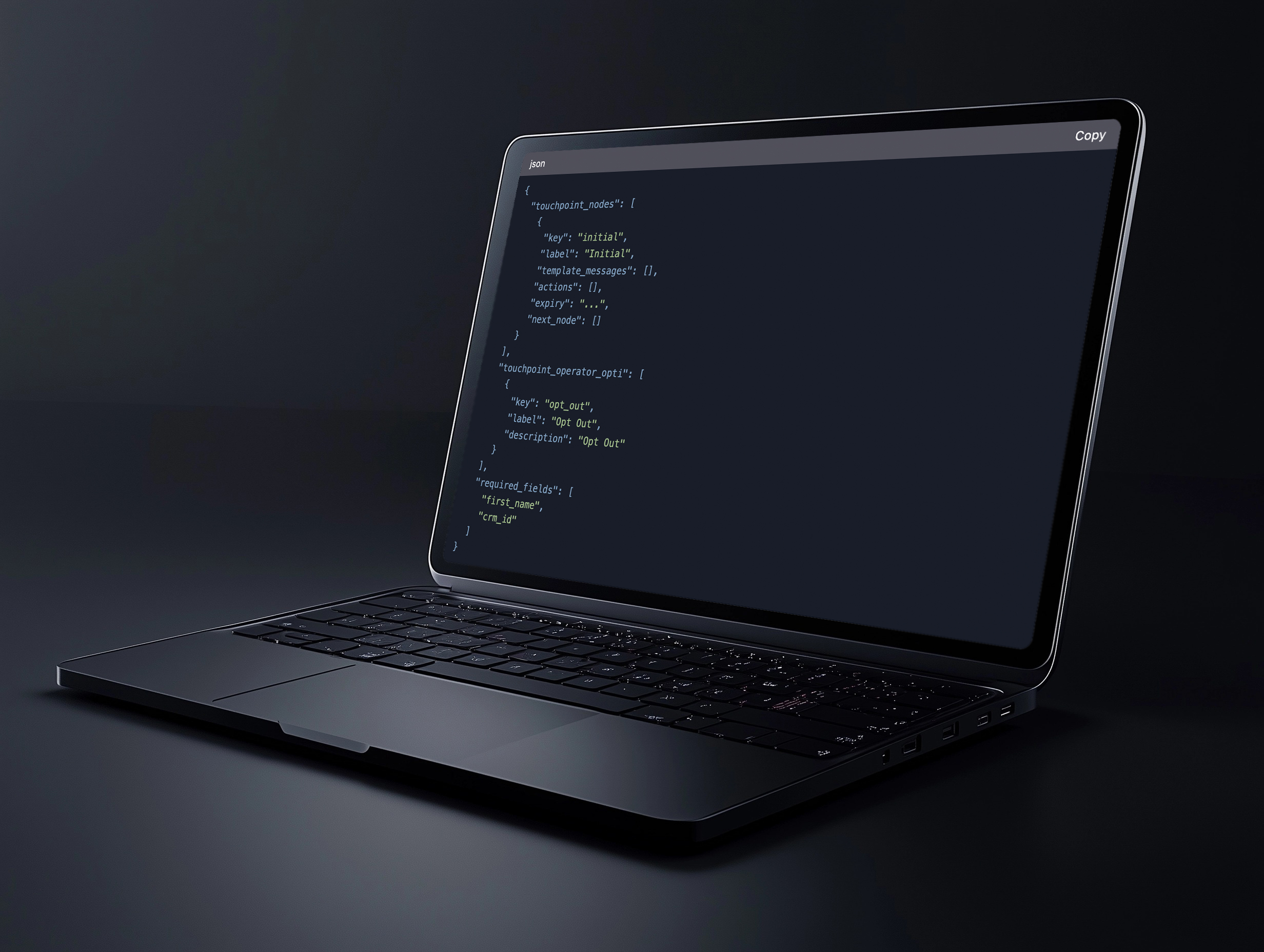
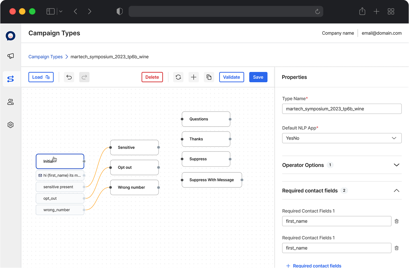
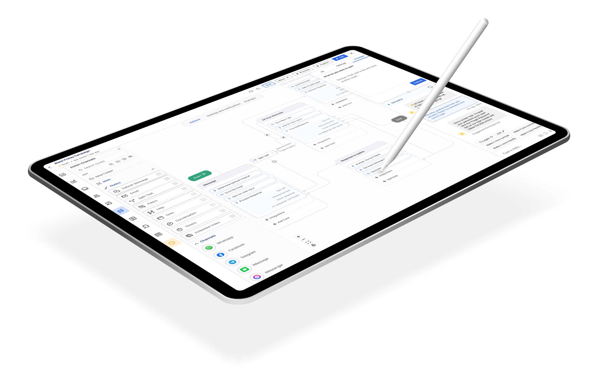
As part of the next phase, we have prioritised addressing more critical issues that can be resolved by the internal team. One such problem is improving the visualisation of touchpoint types for internal users. To achieve this, we propose implementing a Flow Builder that allows internal users to easily load a JSON file and modify conversation flows.
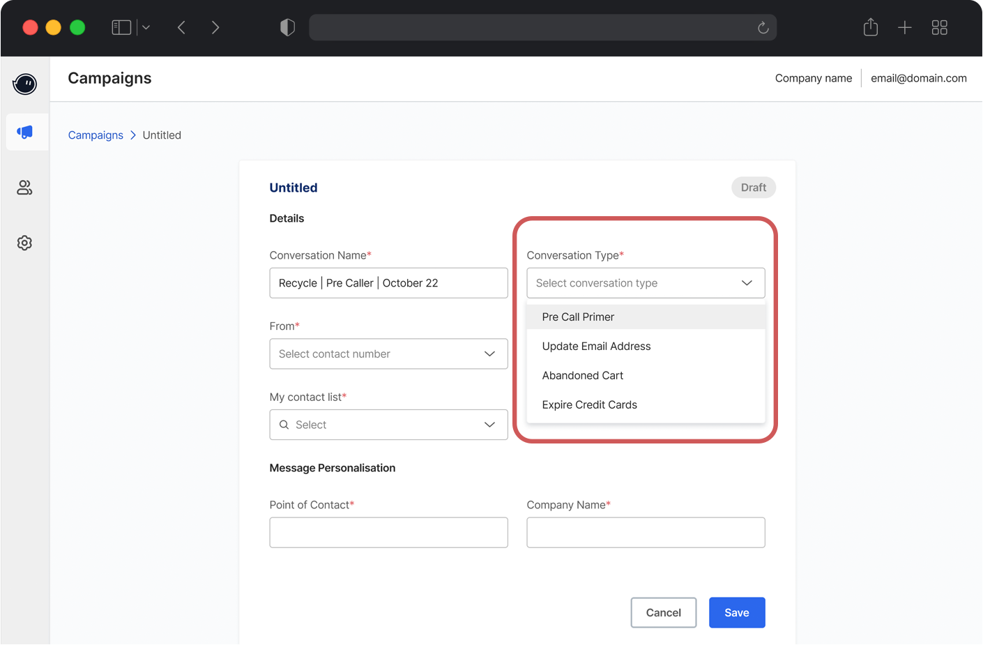
Conversation Type
Conversation types enable workflow automation. For example, an unresolved chat can trigger a follow-up email. Visualizing these automations helps users refine and improve them.
Automating Process
Mapping Workflows
Conversation types can be mapped visually in a Flow Builder to show how different interactions (e.g., chat → email → notification) are connected. This helps internal users understand and optimize the user journey.
Visual and Programmatic Mapping
The Conversr build established a foundation for a future flow builder for internal tools. However, usability challenges remain. Moving forward, my focus is on collaborating with the PM and stakeholders to refine the experience, enhance usability, and evolve Conversr into a seamless B2B solution within the Unified ecosystem.